Unlock a world of possibilities! Login now and discover the exclusive benefits awaiting you.
- Qlik Community
- :
- All Forums
- :
- QlikView App Dev
- :
- Inverted Pivot table
- Subscribe to RSS Feed
- Mark Topic as New
- Mark Topic as Read
- Float this Topic for Current User
- Bookmark
- Subscribe
- Mute
- Printer Friendly Page
- Mark as New
- Bookmark
- Subscribe
- Mute
- Subscribe to RSS Feed
- Permalink
- Report Inappropriate Content
Inverted Pivot table
Hi all, I have a slightly odd requirement and hoping someone can suggest a sensible approach.
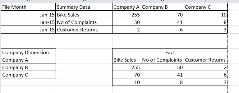
Essentially I have a fact table with random measures in it and your standard Dimension tables, like Company.
I have a requirement whereby the users want to view a comparison of measures by Company however the Company has to go along the columns and the measures in rows, can anyone please suggest a way of achieving this.
Many thanks in advance!
Accepted Solutions
- Mark as New
- Bookmark
- Subscribe
- Mute
- Subscribe to RSS Feed
- Permalink
- Report Inappropriate Content
Shouldn't this just be possible using a standard pivot table chart with dimensions / expressions pivoted as needed?
Have you tried with a pivot table with dimension like File Month and Company and your expressions, then pivot / drag &drop the Company dimension to the top and your expressions to the left?
- Mark as New
- Bookmark
- Subscribe
- Mute
- Subscribe to RSS Feed
- Permalink
- Report Inappropriate Content
Yep you are correct, sorry just me being stupid, when I tried it I wasn't pulling it to the left far enough, I though it had same limitation as Excel, tried it again and it works fine. 
Thanks again!