Unlock a world of possibilities! Login now and discover the exclusive benefits awaiting you.
- Qlik Community
- :
- All Forums
- :
- QlikView
- :
- Is this doable in a scatter plot??
- Subscribe to RSS Feed
- Mark Topic as New
- Mark Topic as Read
- Float this Topic for Current User
- Bookmark
- Subscribe
- Mute
- Printer Friendly Page
- Mark as New
- Bookmark
- Subscribe
- Mute
- Subscribe to RSS Feed
- Permalink
- Report Inappropriate Content
Is this doable in a scatter plot??
Hi Qlik Community,
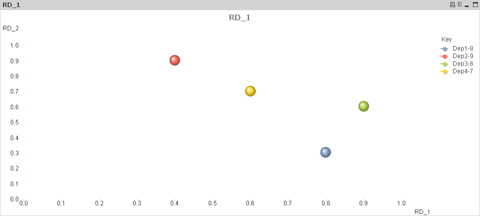
Consider the below data set.
| Department | Metric | RD_1 | RD_2 |
|---|---|---|---|
| Dep1 | 8 | .8 | .3 |
| Dep2 | 9 | .4 | .9 |
| Dep3 | 6 | .9 | .6 |
| Dep4 | 7 | .6 | .7 |
I'm looking to analyze the relationship between metric column and RD(RD_1 and RD_2) columns in other words i'm looking to use a scatter plot to show the relationship. I also want to be able to depict data points such as department, metric, RD_1, RD_2 in the same chart.
Is this possible in a scatter plot? Perhaps there is a different visualization. I'm open for suggestions.
Thanks.
-V
- Mark as New
- Bookmark
- Subscribe
- Mute
- Subscribe to RSS Feed
- Permalink
- Report Inappropriate Content
I think a Scatter chart would be a good choice. You could choose either Department or Metric as the Dimension using a Cycle group.
You mention wanting to plot Department and Metric in the same chart. At the same time? In the data above, there is one to one relationship between Department and Metric, so plotting both on the same chart would be no different than plotting one. In your real data do you have a different relationship between Department and Metric?
-Rob
- Mark as New
- Bookmark
- Subscribe
- Mute
- Subscribe to RSS Feed
- Permalink
- Report Inappropriate Content
Hi Rob,
Thanks for your prompt reply. This wasn't precisely what i was looking for but it definitely steered me in the right direction 
Thanks
V
- Mark as New
- Bookmark
- Subscribe
- Mute
- Subscribe to RSS Feed
- Permalink
- Report Inappropriate Content
You can use ROB suggestion on a cyclic group as there is a 1-1 relationship b/w dept and metrics . If its not a 1-1 relationship you can create a composite key and use that in dimension but if the data is huge it makes the chart looks bad