Unlock a world of possibilities! Login now and discover the exclusive benefits awaiting you.
- Qlik Community
- :
- All Forums
- :
- QlikView
- :
- Limit Line Chart Labels
- Subscribe to RSS Feed
- Mark Topic as New
- Mark Topic as Read
- Float this Topic for Current User
- Bookmark
- Subscribe
- Mute
- Printer Friendly Page
- Mark as New
- Bookmark
- Subscribe
- Mute
- Subscribe to RSS Feed
- Permalink
- Report Inappropriate Content
Limit Line Chart Labels
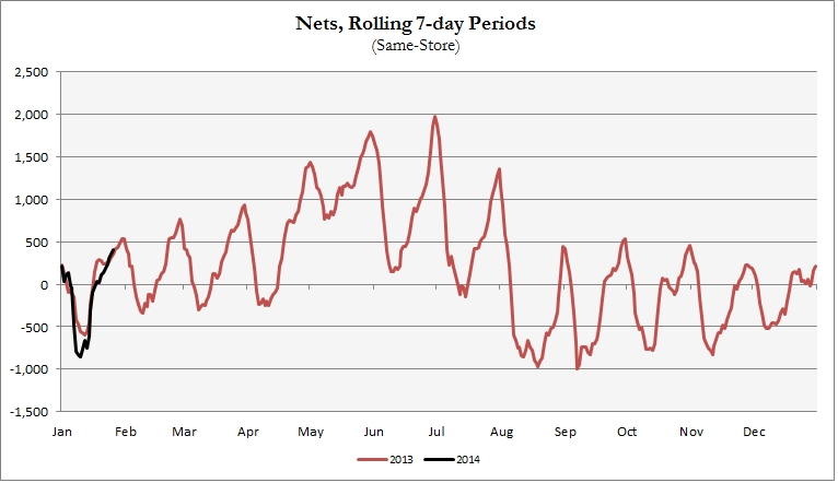
I want to create a chart that contains all 365 days of the year, but only show the labels for the first day of the month (example below). Is this possible?
- Mark as New
- Bookmark
- Subscribe
- Mute
- Subscribe to RSS Feed
- Permalink
- Report Inappropriate Content
Create Two Expressions
Example:
First Expression : SUM(Sales)
Here Tick Line in Expression Tab and Untick Value on Data Points
2nd Expression : If(Month = 'Jan' SUM(Sales))
Here Untick Line in Expression Tab and Tick Value on Data Points...
- Mark as New
- Bookmark
- Subscribe
- Mute
- Subscribe to RSS Feed
- Permalink
- Report Inappropriate Content
This might not be apt workaround for you, but you can use vertical axes to mark / differentiate months
- Mark as New
- Bookmark
- Subscribe
- Mute
- Subscribe to RSS Feed
- Permalink
- Report Inappropriate Content
No. I don't need to display 2 expressions. You can ignore the black line on the chart. I need the chart to display the red line where we can see the different data points for every day of the year, but only show the months as the x-axis label.
- Mark as New
- Bookmark
- Subscribe
- Mute
- Subscribe to RSS Feed
- Permalink
- Report Inappropriate Content
Hi
For the expression, click the + sign and enter an expression to return 1 on the first day of the month in the "Show Values" option.
eg - assuming "Date" is the date field and the chart dimension:
=If(Date = MonthStart(Date), 1, 0)
Make sure the'Values on Data Points' is cleared.
HTH
Jonathan
- Mark as New
- Bookmark
- Subscribe
- Mute
- Subscribe to RSS Feed
- Permalink
- Report Inappropriate Content
Unless I'm doing something wrong, it looks like this adds the point value on the chart for the first of the month. I don't want to show that. I need the x axis to only show the single label for each month, instead of every single day of the year.
Right now, my chart has 365 data points. The x axis shows 1/1/2013 1/2/2013 1/3/2013 all the way to 12/31/2013. I only want it to show Jan Feb Mar....Nov Dec, but I need the chart to still the data points for each day. Just like in the image I attached.