Unlock a world of possibilities! Login now and discover the exclusive benefits awaiting you.
- Qlik Community
- :
- All Forums
- :
- QlikView App Dev
- :
- Line Chart Set Analysis Color Problem
- Subscribe to RSS Feed
- Mark Topic as New
- Mark Topic as Read
- Float this Topic for Current User
- Bookmark
- Subscribe
- Mute
- Printer Friendly Page
- Mark as New
- Bookmark
- Subscribe
- Mute
- Subscribe to RSS Feed
- Permalink
- Report Inappropriate Content
Line Chart Set Analysis Color Problem
I have a line chart with the following...
DIM1: Sales_Group
DIM2: Employee
EXPR: Attainment
=AVG({$<TIME_Year={$(=MAX({1}TIME_Year))},TIME_Year= >}
IF(Enterprise='Yes',
    1.1*Sales_Attainment,
    Sales_Attainment)
)
This gives me one dot per employee, aligned over their sales group for the most recent year in my data. I also wanted to color the dots to highlight those that are Enterprise-level, so under the expression 'Attainment' I wrote the following for 'Background Color'...
=IF(Enterprise='Yes',
    RGB(150,150,150),
    RGB(80,80,80))
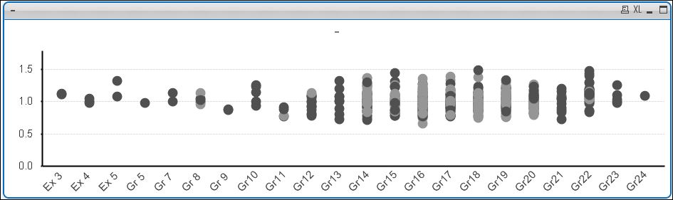
The problem is that some of the dots are the wrong color. Only when I set my 'Year' filter to the max year (to match the set analysis constraint) are all the colors correct. This makes me think that there's a difference between the records the expression is using and the records that the background color formula is using. Somehow the background color is keying on records from previous years. How do I fix this? Is there an easier way to accomplish this?
Thanks.
Accepted Solutions
- Mark as New
- Bookmark
- Subscribe
- Mute
- Subscribe to RSS Feed
- Permalink
- Report Inappropriate Content
Mark, background color expressions, like regular expressions, sometimes need set analysis. Try wrapping the word "Enterprise" in your background color expression in function only() and adding the same set analysis there as in your main expression.
Regards,
Vlad