Unlock a world of possibilities! Login now and discover the exclusive benefits awaiting you.
- Qlik Community
- :
- All Forums
- :
- QlikView App Dev
- :
- Line chart vs Pivot chart
- Subscribe to RSS Feed
- Mark Topic as New
- Mark Topic as Read
- Float this Topic for Current User
- Bookmark
- Subscribe
- Mute
- Printer Friendly Page
- Mark as New
- Bookmark
- Subscribe
- Mute
- Subscribe to RSS Feed
- Permalink
- Report Inappropriate Content
Line chart vs Pivot chart
I have created a pivot tabel wich has the correct calculations, but when transforming it in to a line chart the output is transformed (see screenshot). Why does not the line chart present the same values as the pivot table and how should I do to do so? The expression is the same in the pivotchart as in the line chart.
[View:http://community.qlik.com/cfs-file.ashx/__key/CommunityServer.Discussions.Components.Files/11/8030.Problem-Linje-graf.pptx:550:0]
- Mark as New
- Bookmark
- Subscribe
- Mute
- Subscribe to RSS Feed
- Permalink
- Report Inappropriate Content
Can you upload your Application - sample ?
Regards,
tresesco
- Mark as New
- Bookmark
- Subscribe
- Mute
- Subscribe to RSS Feed
- Permalink
- Report Inappropriate Content
Hi,
Use this data set (could not upload the qvw file) and use the two dimensions week, Brand with the following expression:
RangeAvg(Above(Count(Brand)),Count(Brand),Below(Count(Brand)))/RangeAvg(above(Count({<Brand=>}Total<Week> Week)),Count({<Brand=>}Total<Week> Week),below(Count({<Brand=>}Total<Week> Week)))
[View:http://community.qlik.com/cfs-file.ashx/__key/CommunityServer.Discussions.Components.Files/11/0285.Sample.xlsx:550:0]
- Mark as New
- Bookmark
- Subscribe
- Mute
- Subscribe to RSS Feed
- Permalink
- Report Inappropriate Content
See, i am not getting any difference. Refer to the attached image.
If the issue still persist for you, i think its not because of chart presentation difference, but because of special behavior of Pivot table in case of duplicate data. Check that point, if your modelling creating multiple values against a single combination of dimensions.
Regards,
tresesco
- Mark as New
- Bookmark
- Subscribe
- Mute
- Subscribe to RSS Feed
- Permalink
- Report Inappropriate Content
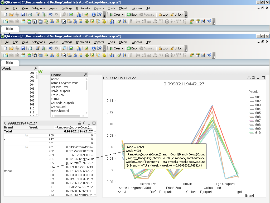
Nope,
it's easier to see the discrepancy if you place weeks on the x-axis.
Try to create the same as on sceenshot attached.

As you can see the levels do not match at all between the line and the column Annat.
- Mark as New
- Bookmark
- Subscribe
- Mute
- Subscribe to RSS Feed
- Permalink
- Report Inappropriate Content
Still No difference !
- Mark as New
- Bookmark
- Subscribe
- Mute
- Subscribe to RSS Feed
- Permalink
- Report Inappropriate Content
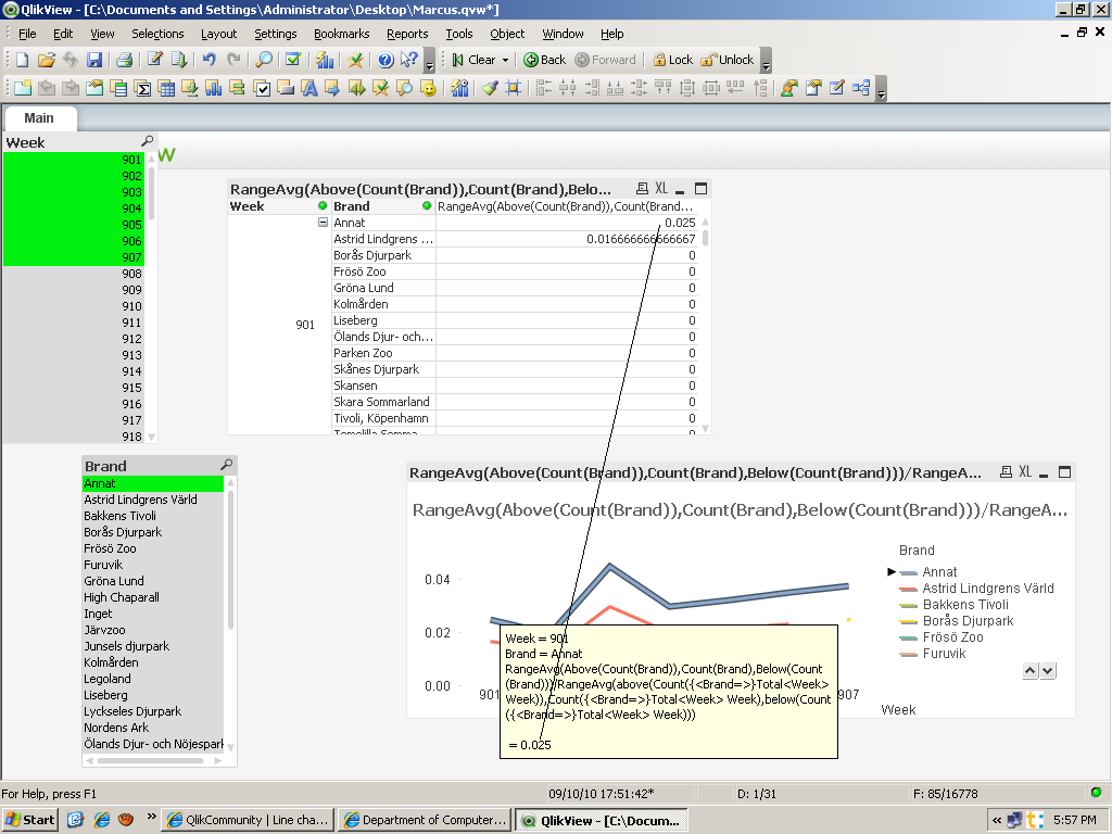
I see now! The result changes when drawing out brand to columns. Otherwise the calculation ends up wrong. The chart does not take that in to account and thus I need to find out how i shall construct the chart in order to match the pivot table where brands are in columns.