Unlock a world of possibilities! Login now and discover the exclusive benefits awaiting you.
- Qlik Community
- :
- All Forums
- :
- QlikView App Dev
- :
- Linear gauge visualization
- Subscribe to RSS Feed
- Mark Topic as New
- Mark Topic as Read
- Float this Topic for Current User
- Bookmark
- Subscribe
- Mute
- Printer Friendly Page
- Mark as New
- Bookmark
- Subscribe
- Mute
- Subscribe to RSS Feed
- Permalink
- Report Inappropriate Content
Linear gauge visualization
Hi,
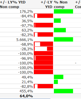
does somebody know how to improve this visualisation? On the Server it Looks perfect, but then on the web, Looks like the diagram showed below. I have used a straight table and for this visualisation showing positive and negative changes. I am using two columns for the same percentage column. When the value is positive, then it is showed on the column "%Non comp", while if negative in the column "+/- LY YtD". Under Visual cues I use as Background red and the Segment is Color White (linear gauge, using min =0 and max =1).
thanks for any help
felipe
dies ist eine App von der Community, aber wichtig ist es, in web view zu sehen
- Mark as New
- Bookmark
- Subscribe
- Mute
- Subscribe to RSS Feed
- Permalink
- Report Inappropriate Content
please share the qvw