Unlock a world of possibilities! Login now and discover the exclusive benefits awaiting you.
- Qlik Community
- :
- All Forums
- :
- QlikView App Dev
- :
- Multiple columns with 1 or 0 as value as dimension...
- Subscribe to RSS Feed
- Mark Topic as New
- Mark Topic as Read
- Float this Topic for Current User
- Bookmark
- Subscribe
- Mute
- Printer Friendly Page
- Mark as New
- Bookmark
- Subscribe
- Mute
- Subscribe to RSS Feed
- Permalink
- Report Inappropriate Content
Multiple columns with 1 or 0 as value as dimensions in bar chart
Hi!
I have data in the following format:
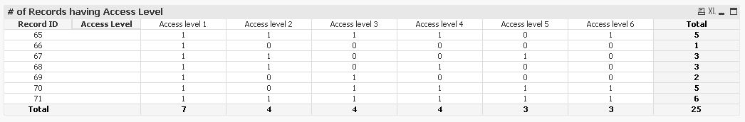
| Record ID | Access level 1 | Access level 2 | Access level 3 | Access level 4 | Access level 5 | Access level 6 |
|---|---|---|---|---|---|---|
| 65 | 1 | 1 | 1 | 1 | 0 | 1 |
| 66 | 1 | 0 | 0 | 0 | 0 | 0 |
| 67 | 1 | 1 | 0 | 0 | 1 | 0 |
| 68 | 1 | 1 | 0 | 1 | 0 | 0 |
| 69 | 1 | 0 | 1 | 0 | 0 | 0 |
| 70 | 1 | 0 | 1 | 1 | 1 | 1 |
| 71 | 1 | 1 | 1 | 1 | 1 | 1 |
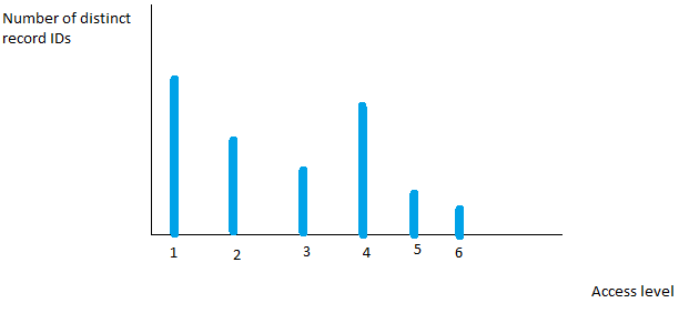
I would like to use this data in a bar chart with one bar for each Access level, with the number of distinct record IDs with the value 1 for that access level. This is to answer the question "How many records had access level 1, 2, 3 and so on?". The value "1" means that the record had the access level, and "0" means it did not.
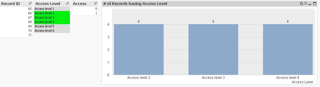
In other words, something like this:
I would greatly appreciate some help with how to do this, preferably with set analysis. I'm guessing I need a calculated dimension, but I don't know what it should be. I've been thinking about using the aggr() funktion, but I can't think of a good expression.
Thanks in advance.
- Tags:
- new_to_qlikview
Accepted Solutions
- Mark as New
- Bookmark
- Subscribe
- Mute
- Subscribe to RSS Feed
- Permalink
- Report Inappropriate Content
Hi,
one solution might be:
tabAccess:
CrossTable ([Access Level], Access)
LOAD *
FROM [http://community.qlik.com/thread/137377] (html, codepage is 1252, embedded labels, table is @1);
hope this helps
regards
Marco
- Mark as New
- Bookmark
- Subscribe
- Mute
- Subscribe to RSS Feed
- Permalink
- Report Inappropriate Content
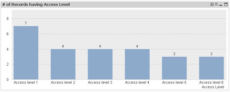
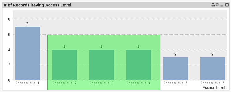
Hi,
Do you mean something like this?
check the attached example,
regards
- Mark as New
- Bookmark
- Subscribe
- Mute
- Subscribe to RSS Feed
- Permalink
- Report Inappropriate Content
Hi Jaime and thank you for your response,
That is the kind of graph I am looking for. However, is it possible to enable selections from this graph? That is, I click on a bar and it updates my selection. I'm guessing I need a dimension for this to be possible?
- Mark as New
- Bookmark
- Subscribe
- Mute
- Subscribe to RSS Feed
- Permalink
- Report Inappropriate Content
Hi,
one solution might be:
tabAccess:
CrossTable ([Access Level], Access)
LOAD *
FROM [http://community.qlik.com/thread/137377] (html, codepage is 1252, embedded labels, table is @1);
hope this helps
regards
Marco
- Mark as New
- Bookmark
- Subscribe
- Mute
- Subscribe to RSS Feed
- Permalink
- Report Inappropriate Content
Hi,
are there any further questions?
regards
Marco