Unlock a world of possibilities! Login now and discover the exclusive benefits awaiting you.
- Qlik Community
- :
- All Forums
- :
- QlikView App Dev
- :
- Pairs of values in Scatter Chart
- Subscribe to RSS Feed
- Mark Topic as New
- Mark Topic as Read
- Float this Topic for Current User
- Bookmark
- Subscribe
- Mute
- Printer Friendly Page
- Mark as New
- Bookmark
- Subscribe
- Mute
- Subscribe to RSS Feed
- Permalink
- Report Inappropriate Content
Pairs of values in Scatter Chart
Hello,
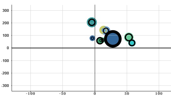
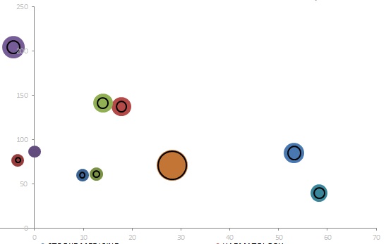
I'm trying to create a Scatter chart using dimensions for the size of the bubbles. I would like to display two bubble sizes for each dimension, one showing actual size vs predicted size. I can produce this in an Excel chart but I don't know how to go on about this in Qlikview - See below. Coloured bubbles are actuals and black hollow bubbles are predictions.
I have tried overlapping two separate charts changing the Z value in each, but for some reason, the sizes of the bubbles in the hollow bubbles graps and the thickness is such that makes the overlapping fail. In the example above, the black hollow bubbles don't increase the thickness of the bubble with it's size.
I would be grateful if anyone could help.
Thanks
- Mark as New
- Bookmark
- Subscribe
- Mute
- Subscribe to RSS Feed
- Permalink
- Report Inappropriate Content
This is what happens when overlapping both graphs modifying Z value: