Unlock a world of possibilities! Login now and discover the exclusive benefits awaiting you.
- Qlik Community
- :
- All Forums
- :
- QlikView App Dev
- :
- Pie Chart visualization: Overlapping values
- Subscribe to RSS Feed
- Mark Topic as New
- Mark Topic as Read
- Float this Topic for Current User
- Bookmark
- Subscribe
- Mute
- Printer Friendly Page
- Mark as New
- Bookmark
- Subscribe
- Mute
- Subscribe to RSS Feed
- Permalink
- Report Inappropriate Content
Pie Chart visualization: Overlapping values
Hi folks,
I have a question regarding pie chart visualization:
The end user wants a pie charts which visualizes his KPI. There are some very high values and some low ones.
Normally, the pie chart is configured, that it creates a virtual dimension "others", where the low values are aggregated. If you click the "others" dimension, then you drill down to the remaining low values.
This is not acceptable for some end users, because they want to export the pie chart to PPT without any drill-down to make.
This is why I changed the minimal value setting for the pie chart to 0.001. This would be the solution, but it leads to overlapping values within the graphic:
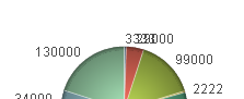
Does anyone have a solution to this problem? Is there any option, that the values at the pie chart can be visualized in a staggered way?
I have included a 'demo example' to this problem.
Any help is highly appreciated!
- « Previous Replies
-
- 1
- 2
- Next Replies »
Accepted Solutions
- Mark as New
- Bookmark
- Subscribe
- Mute
- Subscribe to RSS Feed
- Permalink
- Report Inappropriate Content
Hi,
You can add some stagger using the Repeat function with some carriage returns. See attached. Note the -6 is a static value which should probably be calculated - I will leave that to you.
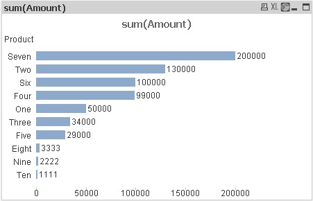
However, I agree with the previous comments that suggest that this is a very poor visualisation of the data - use a straight table (where you can have columns for actual amount and %) or a bar chart.
Regards,
Stephen
- Mark as New
- Bookmark
- Subscribe
- Mute
- Subscribe to RSS Feed
- Permalink
- Report Inappropriate Content
would a vertical barchart (with sorted dimensions) be a solution?
Peter
- Mark as New
- Bookmark
- Subscribe
- Mute
- Subscribe to RSS Feed
- Permalink
- Report Inappropriate Content
Hi Msglanges ,
Can you try to show the values on legend instead of showing them as values on data points .
May be If u can remove the values on data points and select text as pop-up in expression tab and try to select show numbers on legend in presentation tab ...
here is the qwv file ...
- Mark as New
- Bookmark
- Subscribe
- Mute
- Subscribe to RSS Feed
- Permalink
- Report Inappropriate Content
Gud idea Brad,
But best way to present this is Bar chart, as Prieper suggested
- Mark as New
- Bookmark
- Subscribe
- Mute
- Subscribe to RSS Feed
- Permalink
- Report Inappropriate Content
Am Bradd schrieb:
Hi Msglanges ,
Can you try to show the values on legend instead of showing them as values on data points .
May be If u can remove the values on data points and select text as pop-up in expression tab and try to select show numbers on legend in presentation tab ...
here is the qwv file ...
Hi Am Bradd,
I also had this solution in mind, unfortunately the user thinks that it is not as easy to grasp in a management meeting than having the actual values in the graphic.
But thanks anyway, it is a helpful thought!
- Mark as New
- Bookmark
- Subscribe
- Mute
- Subscribe to RSS Feed
- Permalink
- Report Inappropriate Content
prieper schrieb:
would a vertical barchart (with sorted dimensions) be a solution?
Peter

Unfortunately this is not what the user wants to see... nevertheless, thank you for your input!
- Mark as New
- Bookmark
- Subscribe
- Mute
- Subscribe to RSS Feed
- Permalink
- Report Inappropriate Content
Hello,
I took sometime and did this. If I was you, this looks a lot better I dont know if its really useful, but Pie charts are used to show percentages rather than the actual numbers.
Thanks
ANDY
- Mark as New
- Bookmark
- Subscribe
- Mute
- Subscribe to RSS Feed
- Permalink
- Report Inappropriate Content
In the barchart you may display the percentages as well (choose to show on the axis) or group the expression, one to show the value, the other the percentages.
Peter
- Mark as New
- Bookmark
- Subscribe
- Mute
- Subscribe to RSS Feed
- Permalink
- Report Inappropriate Content
Hi,
Please find the attachment. it will help you out.
At expression click on(+)sign and add the expression in Pie popup and in presentation set "lower limit on slice".
As shown in attachment.
Regards
Neetu SIngh
- Mark as New
- Bookmark
- Subscribe
- Mute
- Subscribe to RSS Feed
- Permalink
- Report Inappropriate Content
Hi,
You can add some stagger using the Repeat function with some carriage returns. See attached. Note the -6 is a static value which should probably be calculated - I will leave that to you.
However, I agree with the previous comments that suggest that this is a very poor visualisation of the data - use a straight table (where you can have columns for actual amount and %) or a bar chart.
Regards,
Stephen
- « Previous Replies
-
- 1
- 2
- Next Replies »