Unlock a world of possibilities! Login now and discover the exclusive benefits awaiting you.
- Qlik Community
- :
- All Forums
- :
- QlikView App Dev
- :
- Plot a stacked bar chart with 4 dimensions and rat...
- Subscribe to RSS Feed
- Mark Topic as New
- Mark Topic as Read
- Float this Topic for Current User
- Bookmark
- Subscribe
- Mute
- Printer Friendly Page
- Mark as New
- Bookmark
- Subscribe
- Mute
- Subscribe to RSS Feed
- Permalink
- Report Inappropriate Content
Plot a stacked bar chart with 4 dimensions and rate axis
Hi,
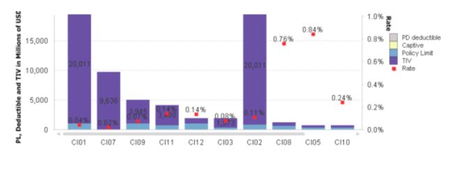
I have a stacked bar chart with 5 dimensions. I am trying to plot the them as 5 measures of different scale. The sample data is attached. i need to plot the amounts in left axis and the rate in Y axis in Qlikview.
Can anyone help me in acheiving the same in Qlikview?
When i plot this in primary and secondary axis, iam getting the graph like below. Its dynamically plotting the x values. Can it be as in the excel graph
- Mark as New
- Bookmark
- Subscribe
- Mute
- Subscribe to RSS Feed
- Permalink
- Report Inappropriate Content
Hi Nimmy,
with the secondary axis option in qlikview bar chart we can easily achieve this..
Let me know if you need more help
HTH
Sreeni
- Mark as New
- Bookmark
- Subscribe
- Mute
- Subscribe to RSS Feed
- Permalink
- Report Inappropriate Content
Hi,
I tried that option but i need the rate on right and the amount fields plotted on left
Regards,
Nimmy
- Mark as New
- Bookmark
- Subscribe
- Mute
- Subscribe to RSS Feed
- Permalink
- Report Inappropriate Content
When i plot this in primary and secondary axis, iam getting the graph like below. Its dynamically plotting the x values. Can it be as in the excel graph
- Mark as New
- Bookmark
- Subscribe
- Mute
- Subscribe to RSS Feed
- Permalink
- Report Inappropriate Content
Any help on this?
- Mark as New
- Bookmark
- Subscribe
- Mute
- Subscribe to RSS Feed
- Permalink
- Report Inappropriate Content
As it is having 4 different expressions with different value range any suggestion to plot the X Axis value range from 0.1, 1, 10, 100 etc as attached?