Unlock a world of possibilities! Login now and discover the exclusive benefits awaiting you.
- Qlik Community
- :
- All Forums
- :
- QlikView App Dev
- :
- Problem with values on chart data points
- Subscribe to RSS Feed
- Mark Topic as New
- Mark Topic as Read
- Float this Topic for Current User
- Bookmark
- Subscribe
- Mute
- Printer Friendly Page
- Mark as New
- Bookmark
- Subscribe
- Mute
- Subscribe to RSS Feed
- Permalink
- Report Inappropriate Content
Problem with values on chart data points
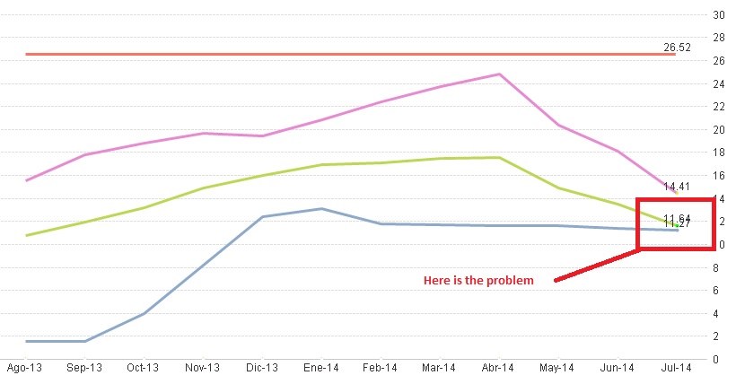
Hi, i have a line chart with values on data points. The problem is when two or more values on different expressions have a closed value because it looks stacked and this is imposible to read.
i hope somebody can to help me find anyway to resolve this problem.
- Tags:
- new_to_qlikview
- « Previous Replies
-
- 1
- 2
- Next Replies »
- Mark as New
- Bookmark
- Subscribe
- Mute
- Subscribe to RSS Feed
- Permalink
- Report Inappropriate Content
Can you send an example to see them?
- Mark as New
- Bookmark
- Subscribe
- Mute
- Subscribe to RSS Feed
- Permalink
- Report Inappropriate Content
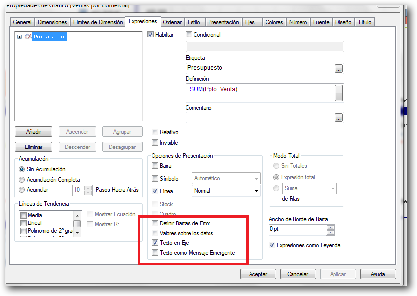
Its possible to come up with a conditional expression for the 'text color' under the expression that makes the color of the values transparent or not . This sample expression makes the text transparent (hides it) if there is more than one value for the x axis point: if( count( distinct <line dimension>) > 1 , ARGB(0,128,128,128), ARGB(255,128,128,128))
But thats a simple scenario and could easily filter out most of your values. You can get more sophisticated but it could get very complicated.
For what its worth, this kind of 'smart visualization' has been added in Qlik Sense. Here is a screenshot with no fancy properties or experessions to achieve this: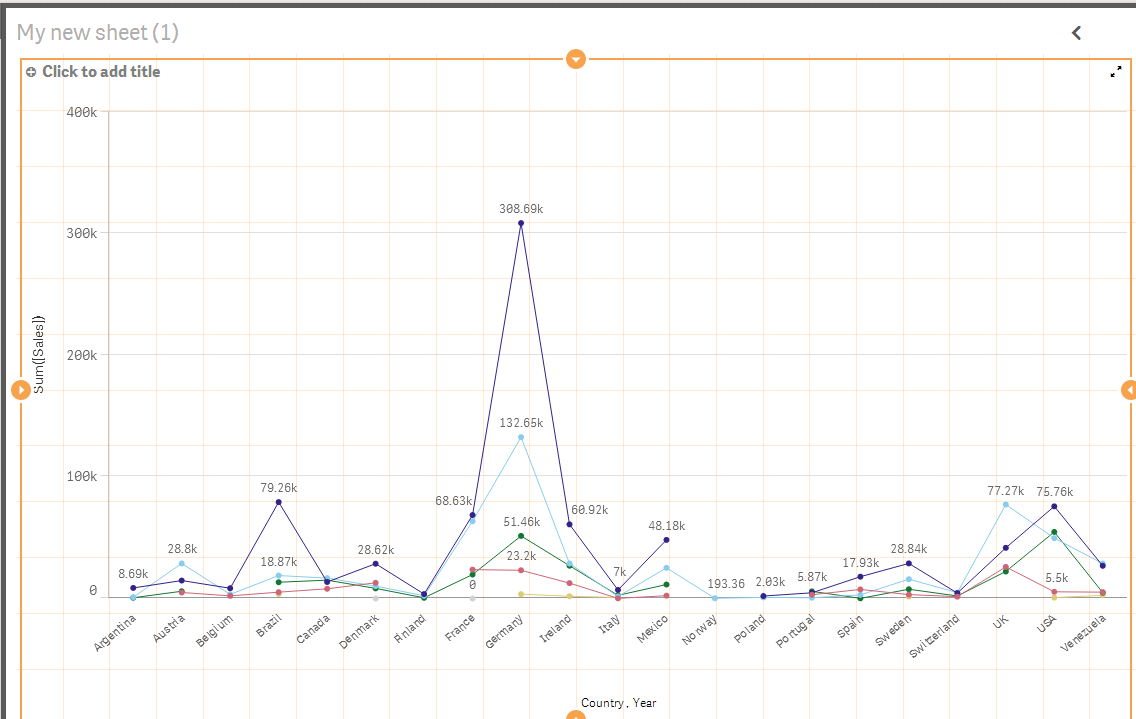
- Mark as New
- Bookmark
- Subscribe
- Mute
- Subscribe to RSS Feed
- Permalink
- Report Inappropriate Content
- Mark as New
- Bookmark
- Subscribe
- Mute
- Subscribe to RSS Feed
- Permalink
- Report Inappropriate Content
For a better view, I suggest to change to a horizontal view in style. Try it.
Saludos,
Enrique Colomer
- Mark as New
- Bookmark
- Subscribe
- Mute
- Subscribe to RSS Feed
- Permalink
- Report Inappropriate Content
Thank for tour response Jonathan, but i have to show it, i would like to find anyway to move value label for view both expression values.
- Mark as New
- Bookmark
- Subscribe
- Mute
- Subscribe to RSS Feed
- Permalink
- Report Inappropriate Content
Thanks, but modify my model means that project could be dismissed. i have to find the way to move these values without make visual changes
- Mark as New
- Bookmark
- Subscribe
- Mute
- Subscribe to RSS Feed
- Permalink
- Report Inappropriate Content
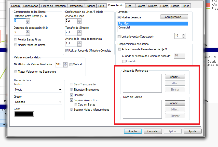
Another solution is put the value in line axis,
- Mark as New
- Bookmark
- Subscribe
- Mute
- Subscribe to RSS Feed
- Permalink
- Report Inappropriate Content
my values are stacked in this moment, i only want to make that two expression can be readed without problems. i can't make that you tell me because the requirement is show it at line end.
i haven't be able to find how to solve it. May this be solve?
- Mark as New
- Bookmark
- Subscribe
- Mute
- Subscribe to RSS Feed
- Permalink
- Report Inappropriate Content
Another possibility are put the value in a text with the expression
- « Previous Replies
-
- 1
- 2
- Next Replies »