Unlock a world of possibilities! Login now and discover the exclusive benefits awaiting you.
- Qlik Community
- :
- All Forums
- :
- QlikView App Dev
- :
- Process visualization over time
- Subscribe to RSS Feed
- Mark Topic as New
- Mark Topic as Read
- Float this Topic for Current User
- Bookmark
- Subscribe
- Mute
- Printer Friendly Page
- Mark as New
- Bookmark
- Subscribe
- Mute
- Subscribe to RSS Feed
- Permalink
- Report Inappropriate Content
Process visualization over time
Hello all!
I have a very simple process where items are in different status over time. I have visualised the current status and amount in a table as below. Very simple. Now, I need to show how these statuses have changed over time and I don't want to create a table for each day in history... So how do you suggest this can be displayed in the best way?
Sparklines in the "current" table? - Comparison would be difficult.
Trendline chart with amount on Y-axis, time on x-axis and status as dimension?
Any other suggestion?
Br
Cris
Current:
| Status1 | Status2 | Status3 | Status4 | Status5 |
|---|---|---|---|---|
| 200 | 300 | 50 | 20 | 10 |
Yesterday:
| Status1 | Status2 | Status3 | Status4 | Status5 |
|---|---|---|---|---|
| 100 | 400 | 25 | 80 | 90 |
Accepted Solutions
- Mark as New
- Bookmark
- Subscribe
- Mute
- Subscribe to RSS Feed
- Permalink
- Report Inappropriate Content
Hi,
If you need to see both amount and compare to yesterday, you can make like this:

Does it fit for you?
Marc.
- Mark as New
- Bookmark
- Subscribe
- Mute
- Subscribe to RSS Feed
- Permalink
- Report Inappropriate Content
I think that line chart is the best idea ... Time and Values on axis.
- Mark as New
- Bookmark
- Subscribe
- Mute
- Subscribe to RSS Feed
- Permalink
- Report Inappropriate Content
Hi,
If you want to compare status volume in two different times, I would try to work with incremental values in a bar chart with status as dimension.
Marc.
- Mark as New
- Bookmark
- Subscribe
- Mute
- Subscribe to RSS Feed
- Permalink
- Report Inappropriate Content
Thank you Alessandro. Thats my best alternative right now.
- Mark as New
- Bookmark
- Subscribe
- Mute
- Subscribe to RSS Feed
- Permalink
- Report Inappropriate Content
Hi Marc,
What do you mean by incremental values on a bar chart? - One bar per status and amount on the y-axis? Should I use a stacked bar chart to show the values for different time? the x-axis would be status and time? or time and status?
Sorry for all questions.
Br
cris
- Mark as New
- Bookmark
- Subscribe
- Mute
- Subscribe to RSS Feed
- Permalink
- Report Inappropriate Content
Hi,
I meant something like this:
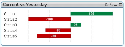
If you want to compare current and yesterday, the incremental display will be fine. Otherwise, if you need to analize the current amount, use bar chart with total amounts.
Hope it helps.
Marc.
- Mark as New
- Bookmark
- Subscribe
- Mute
- Subscribe to RSS Feed
- Permalink
- Report Inappropriate Content
Hi,
If you need to see both amount and compare to yesterday, you can make like this:
Does it fit for you?
Marc.
- Mark as New
- Bookmark
- Subscribe
- Mute
- Subscribe to RSS Feed
- Permalink
- Report Inappropriate Content
Hi,
Did it help? If yes please close thread by selecting correct answer.
Marc.
- Mark as New
- Bookmark
- Subscribe
- Mute
- Subscribe to RSS Feed
- Permalink
- Report Inappropriate Content
Gracias. It did help and I forgot to close the thread.
Br
Cris