Unlock a world of possibilities! Login now and discover the exclusive benefits awaiting you.
- Qlik Community
- :
- All Forums
- :
- QlikView App Dev
- :
- Qlikview: Color coding a single bar chart with mul...
- Subscribe to RSS Feed
- Mark Topic as New
- Mark Topic as Read
- Float this Topic for Current User
- Bookmark
- Subscribe
- Mute
- Printer Friendly Page
- Mark as New
- Bookmark
- Subscribe
- Mute
- Subscribe to RSS Feed
- Permalink
- Report Inappropriate Content
Qlikview: Color coding a single bar chart with multiple expressions
Hi,
I have a barchart that has two expressions "Number of Sales" and "Average Sales Amount"
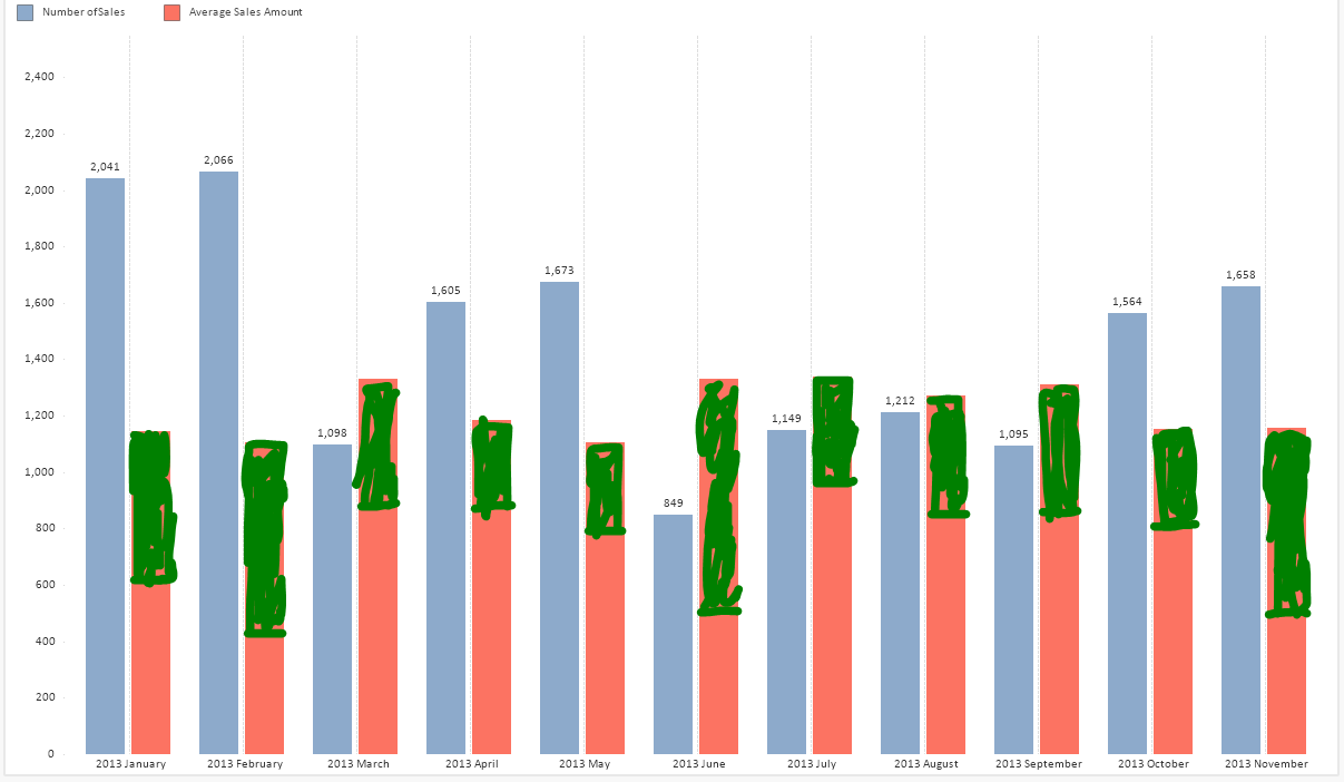
I want to color code only the "Average Sales Amount" bar by the Gender Dimension. The chart should look similar to below.
I am attaching my sample qvw.
Accepted Solutions
- Mark as New
- Bookmark
- Subscribe
- Mute
- Subscribe to RSS Feed
- Permalink
- Report Inappropriate Content
With some playing around, I actually got it looking like you suggested
Se also attached
- Mark as New
- Bookmark
- Subscribe
- Mute
- Subscribe to RSS Feed
- Permalink
- Report Inappropriate Content
Not sure - i understand the request for below one
I want to color code only the "Average Sales Amount" bar by the Gender Dimension.
- Mark as New
- Bookmark
- Subscribe
- Mute
- Subscribe to RSS Feed
- Permalink
- Report Inappropriate Content
There is a Gender Dimension, I want to add it to the Chart and make only the Average Sales Amount bar get colored by the gender dimension. Similar to below. Only the bar for "Average Sales Amount" should be affected the "Number of Sales" bar should not be affected.

- Mark as New
- Bookmark
- Subscribe
- Mute
- Subscribe to RSS Feed
- Permalink
- Report Inappropriate Content
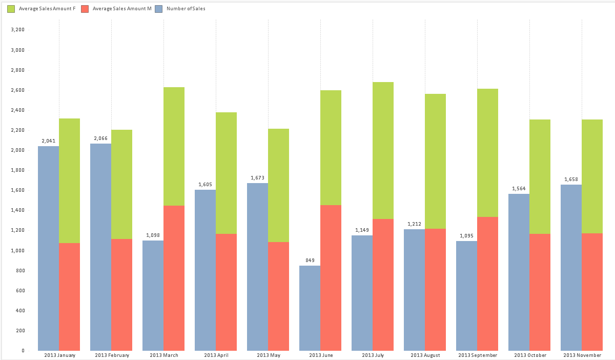
It think this is the closest you can get to what you want, or you should stack all bars.
Split the Average Sales Amount expression into the two gender values e.g.
= AVG({<Gender={'M'}>}SalesAmount)
and use an offset for the second gender expression
Also see attached
- Mark as New
- Bookmark
- Subscribe
- Mute
- Subscribe to RSS Feed
- Permalink
- Report Inappropriate Content
With some playing around, I actually got it looking like you suggested
Se also attached
- Mark as New
- Bookmark
- Subscribe
- Mute
- Subscribe to RSS Feed
- Permalink
- Report Inappropriate Content
This works even though I am struggling to understand the solution.
- Mark as New
- Bookmark
- Subscribe
- Mute
- Subscribe to RSS Feed
- Permalink
- Report Inappropriate Content
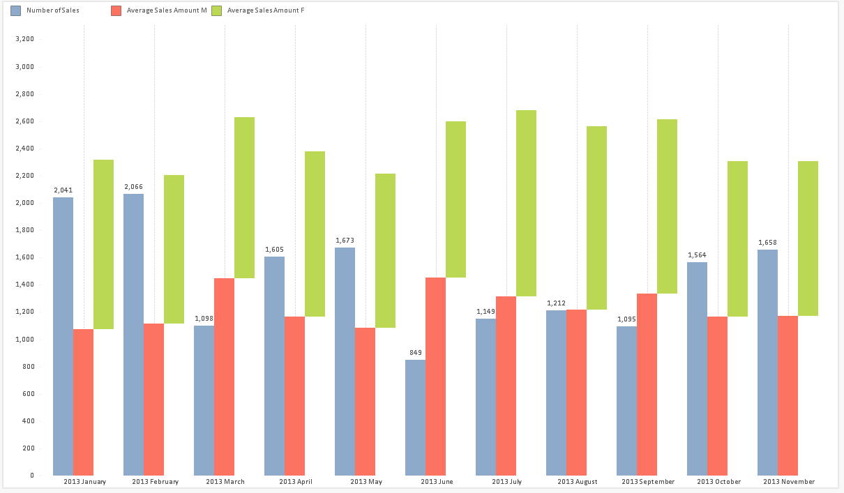
Instead of a Gender dimension that would split the Number of Sales expression as well and would display Gender=M or F in the mouse over, I used a synthetic dimension ValueList with two values. I've hided the legend for this dimension, so it does not display in the x axis. It does in the mouse over, but with a rather anonymous group=1 or 2 (you could alter the label to 'Bar', so it would display Bar =1 or 2).
All the expressions only result in a value for one of the two values from the synthetic dimension, 0 and Null values are not displayed in the chart. The Number of sales expression has a value for Group 1 (or Bar 1 as you will) and the two Average Sales Amount expressions (split by gender) have a value for Group=2.