Unlock a world of possibilities! Login now and discover the exclusive benefits awaiting you.
- Qlik Community
- :
- All Forums
- :
- QlikView App Dev
- :
- Query in linear Guage Chart
- Subscribe to RSS Feed
- Mark Topic as New
- Mark Topic as Read
- Float this Topic for Current User
- Bookmark
- Subscribe
- Mute
- Printer Friendly Page
- Mark as New
- Bookmark
- Subscribe
- Mute
- Subscribe to RSS Feed
- Permalink
- Report Inappropriate Content
Query in linear Guage Chart
Hi Guys,
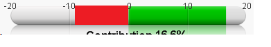
I need help with the linear gauge chart in which I want to show the positive values in Green color and negative values in Red color.
The color should start from the 0 and if the count is positive then it should show green color towards right and if the count is negative then it should show red color towards left starting from middle count 0.
Below is the screen shot for reference :
Kindly help.
- Mark as New
- Bookmark
- Subscribe
- Mute
- Subscribe to RSS Feed
- Permalink
- Report Inappropriate Content
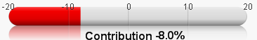
As if now the negative count is showing with the red color, but starting from -20 not from middle 0 instead it should start from middle 0.
Below is the screen shot for reference :
- Mark as New
- Bookmark
- Subscribe
- Mute
- Subscribe to RSS Feed
- Permalink
- Report Inappropriate Content
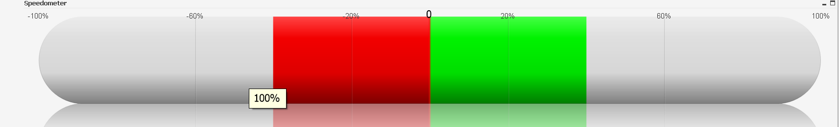
No Dimension
Expression=0
Presentation tab:
Min= -1
Max = 1
Segment 1 -.4 (Red)
Segment 2 0.0 (Green)
Segment 3 .4 (Transparent)