Unlock a world of possibilities! Login now and discover the exclusive benefits awaiting you.
Announcements
April 13–15 - Dare to Unleash a New Professional You at Qlik Connect 2026: Register Now!
- Qlik Community
- :
- All Forums
- :
- QlikView App Dev
- :
- Sand Chart Incorrectly Drawing Lines?
Options
- Subscribe to RSS Feed
- Mark Topic as New
- Mark Topic as Read
- Float this Topic for Current User
- Bookmark
- Subscribe
- Mute
- Printer Friendly Page
Turn on suggestions
Auto-suggest helps you quickly narrow down your search results by suggesting possible matches as you type.
Showing results for
Not applicable
2014-10-28
12:30 PM
- Mark as New
- Bookmark
- Subscribe
- Mute
- Subscribe to RSS Feed
- Permalink
- Report Inappropriate Content
Sand Chart Incorrectly Drawing Lines?
Hi all -
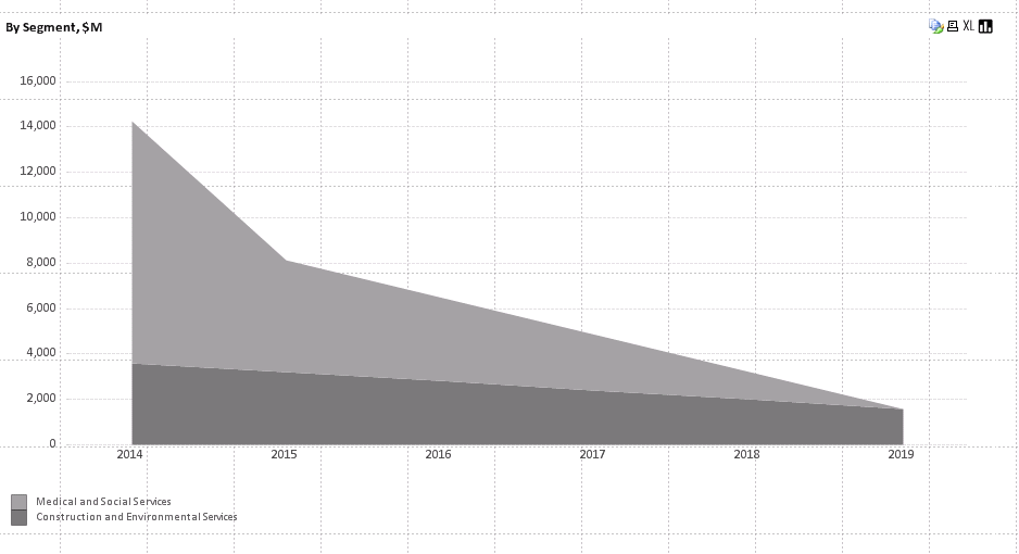
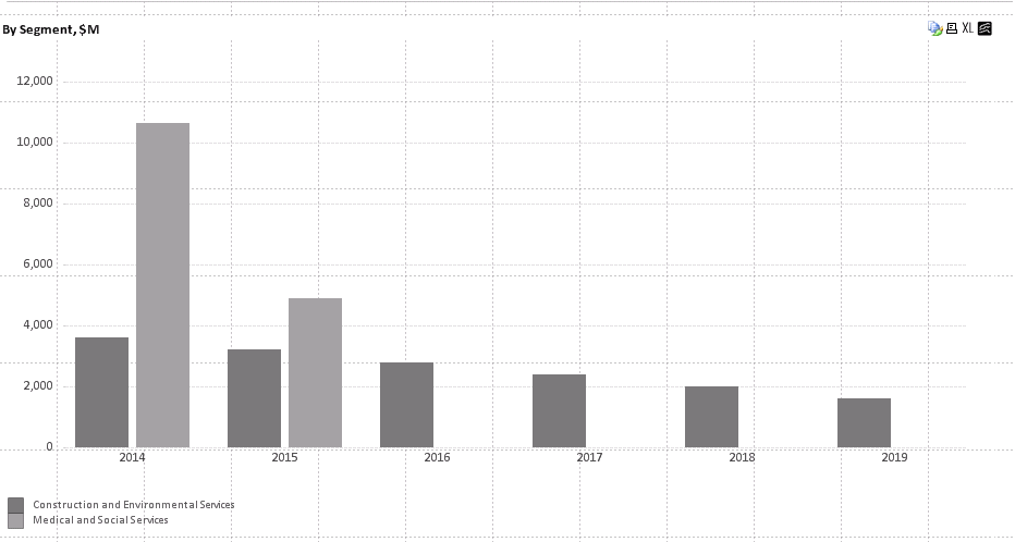
I noticed today that my sand charts are incorrectly drawing lines and implying there is value where actually none exists. Is there any way to correct this? It's *extremely* misleading. Graph shown below - sand chart (incorrect) and bar chart (correct).


Thank you!
470 Views
0 Replies