Unlock a world of possibilities! Login now and discover the exclusive benefits awaiting you.
- Qlik Community
- :
- All Forums
- :
- QlikView App Dev
- :
- Scatter Plot- Is QlikView implementation short of ...
- Subscribe to RSS Feed
- Mark Topic as New
- Mark Topic as Read
- Float this Topic for Current User
- Bookmark
- Subscribe
- Mute
- Printer Friendly Page
- Mark as New
- Bookmark
- Subscribe
- Mute
- Subscribe to RSS Feed
- Permalink
- Report Inappropriate Content
Scatter Plot- Is QlikView implementation short of the Ideal
Hi,
I have been using QlikView for around 6 months now, and am impressed by its Data Discovery capabilities.
However, if I my understanding is correct, it appears that the Scatter Plot implementation is not ideal.
Quoting from the book, Making Sense of Data (Glenn J Myatt, Wiley-2007):
Scatterplots can be used to identify whether any relationship exists between two continuous variables based on the ratio or interval scales. The two variables are plotted on the x- and y-axes. Each point displayed on the scatterplot is a single observation. The position of the point is determined by the value of the two variables.
A scatter plot, by default, should attempt plotting EVERY data point. QlikView mandates a dimension, and then proceeds by default to sum the two variables selected (x & y). In case you want every point to be plotted, the primary key of the data set would have to be selected, which will lead to the legend giving strange values.
Is there a better way to use scatter plots in QlikView?
- Tags:
- scatterplot
- « Previous Replies
-
- 1
- 2
- Next Replies »
- Mark as New
- Bookmark
- Subscribe
- Mute
- Subscribe to RSS Feed
- Permalink
- Report Inappropriate Content
Thanks HIC.
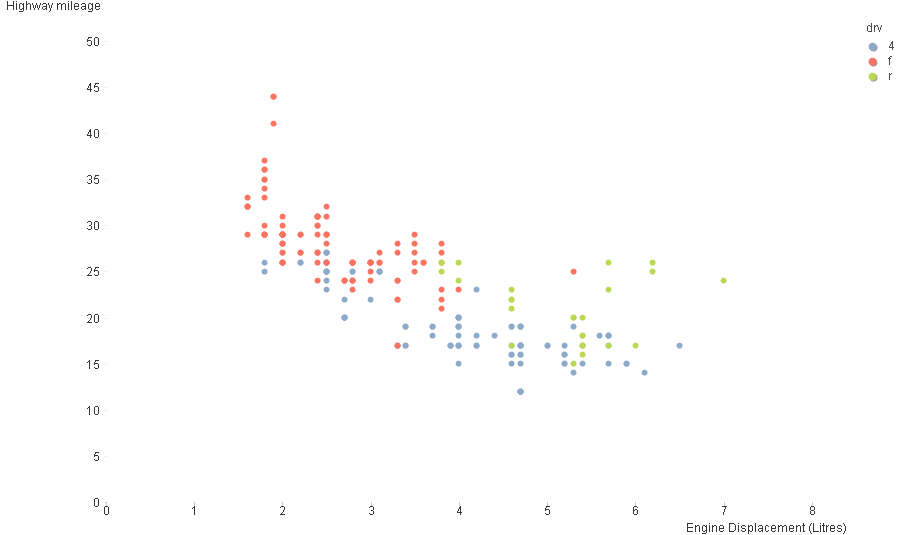
Got the plot exactly the way I wanted. Used the second dimension as the one I wanted highlighted on the chart (it also showed up as the legend automatically), and changed the display to symbol only. Here's how it looks:
So, QlikView DOES offer greater flexibility.

- Mark as New
- Bookmark
- Subscribe
- Mute
- Subscribe to RSS Feed
- Permalink
- Report Inappropriate Content
Hi Swuehl ,
This is exactly what i want , but i am not able to get it .
Is there any specific settings you are making in the above doc ?
Bhushan N
- Mark as New
- Bookmark
- Subscribe
- Mute
- Subscribe to RSS Feed
- Permalink
- Report Inappropriate Content
That discussion is quite old, so I don't really remember a specific setting, but I think there isn't one other than discussed above.
Maybe it's better if you create a new thread, post your current sample QVW and describe your requirements / expected result.
- « Previous Replies
-
- 1
- 2
- Next Replies »