Unlock a world of possibilities! Login now and discover the exclusive benefits awaiting you.
- Qlik Community
- :
- All Forums
- :
- QlikView App Dev
- :
- Separating Data that contains percentage format an...
Options
- Subscribe to RSS Feed
- Mark Topic as New
- Mark Topic as Read
- Float this Topic for Current User
- Bookmark
- Subscribe
- Mute
- Printer Friendly Page
Turn on suggestions
Auto-suggest helps you quickly narrow down your search results by suggesting possible matches as you type.
Showing results for
Not applicable
2015-05-25
06:27 AM
- Mark as New
- Bookmark
- Subscribe
- Mute
- Subscribe to RSS Feed
- Permalink
- Report Inappropriate Content
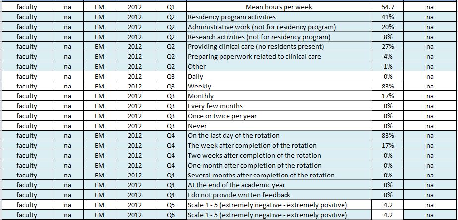
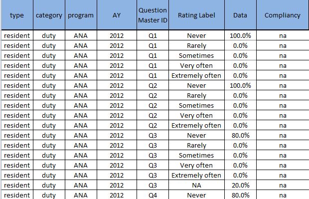
Separating Data that contains percentage format and numericals in the same field
I have a table that has its field containing numericals and Percentage values. Initially i thought it was alright but i find it hard to plot my chart.
I need some advice on how i can progress from here. I need to display it accordingly as a stack chart
and for the "mean hours per week" in the form of line graph. Do note that i would prefer to keep the table the same.
Some recommendations would be nice. I am really weak with charts.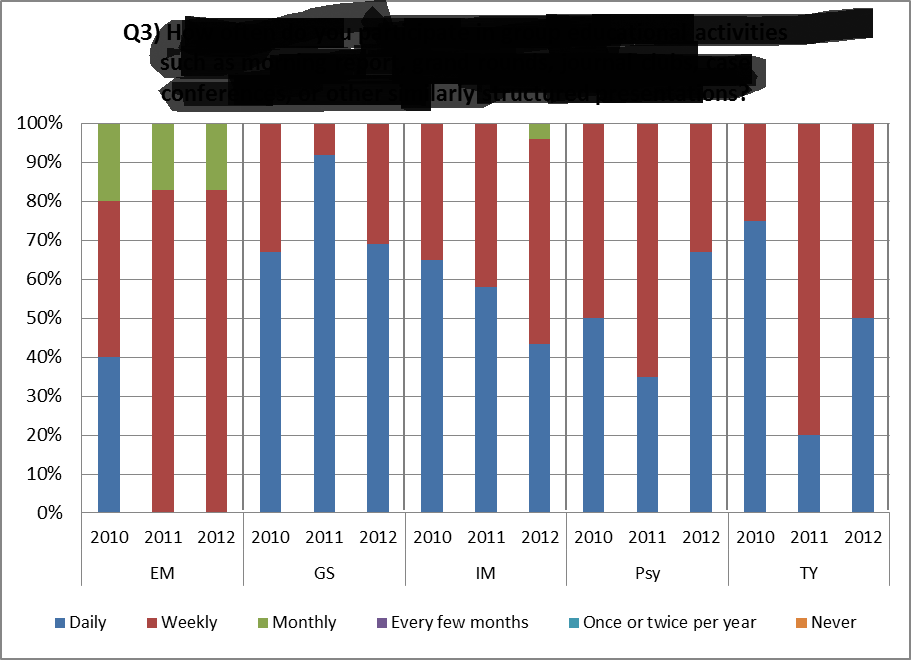
The two tables are arranged to their fields.
304 Views
0 Replies