Unlock a world of possibilities! Login now and discover the exclusive benefits awaiting you.
- Qlik Community
- :
- All Forums
- :
- QlikView App Dev
- :
- Split Rows
- Subscribe to RSS Feed
- Mark Topic as New
- Mark Topic as Read
- Float this Topic for Current User
- Bookmark
- Subscribe
- Mute
- Printer Friendly Page
- Mark as New
- Bookmark
- Subscribe
- Mute
- Subscribe to RSS Feed
- Permalink
- Report Inappropriate Content
Split Rows
Hi All ,
Thanks for your quick response. but it is not working as per my requirement.See below example I would like to generate my chart like this.In my chart x-axis showing 1 ,2 ,3 ,4 ,5 etc.I means (0-30 Rows) and 2 means (30-60 Rows) like that to show in my chart.

Regards,
Satish
Hi All,
I Have a column called ID it contains 100 rows.As per my Requirement my line chart to show the range of 0-30 rows 1Datapoint and 30-60 2Datepoint and 60-90 3Datapoint because we considering each 30 rows one datapoint ,and also rest of 10 rows i don't want to show in my chart.
| ID | %Value |
|---|---|
| 0-30 | 63.00% |
| 30-60 | 75.35% |
| 60-90 | 85.55% |
I am using Class function like Class(ID,30) but it is displaying last last 10 rows percentage also.
Regards,
Satish
- Tags:
- new_to_qlikview
- « Previous Replies
-
- 1
- 2
- Next Replies »
- Mark as New
- Bookmark
- Subscribe
- Mute
- Subscribe to RSS Feed
- Permalink
- Report Inappropriate Content
Go to your Expression Tab
and use something like similar
COUNT({<ID = {"<=90"}>}FieldName)
Or Change your Calculated Dimension as below
=CLASS(IF(ID<=90,ID), 30)
Tick Suppress When Value is Null
Edit : Changed 90 instead of 60 to get data upto ID 90
- Mark as New
- Bookmark
- Subscribe
- Mute
- Subscribe to RSS Feed
- Permalink
- Report Inappropriate Content
Try this
Regards
MR
- Mark as New
- Bookmark
- Subscribe
- Mute
- Subscribe to RSS Feed
- Permalink
- Report Inappropriate Content
Hi Rosso,
Thanks for your quick response. but it is not working as per my requirement.See below example I would like to generate my chart like this.In my chart x-axis showing 1 ,2 ,3 ,4 ,5 etc.I means (0-30 Rows) and 2 means (30-60 Rows) like that to show in my chart. 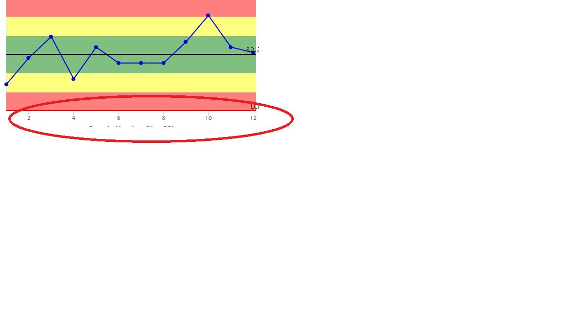
- Mark as New
- Bookmark
- Subscribe
- Mute
- Subscribe to RSS Feed
- Permalink
- Report Inappropriate Content
Hi Manish,
Thanks for your quick response. but it is not working as per my requirement.See below example I would like to generate my chart like this.In my chart x-axis showing 1 ,2 ,3 ,4 ,5 etc.I means (0-30 Rows) and 2 means (30-60 Rows) like that to show in my chart.

Regards,
Satish
- Mark as New
- Bookmark
- Subscribe
- Mute
- Subscribe to RSS Feed
- Permalink
- Report Inappropriate Content
Try to define your ID classes in the script and use that new field as dimension of your chart.
MR
- Mark as New
- Bookmark
- Subscribe
- Mute
- Subscribe to RSS Feed
- Permalink
- Report Inappropriate Content
Hi Manish,
Thanks for your quick response. but it is not working as per my requirement.See below example I would like to generate my chart like this.In my chart x-axis showing 1 ,2 ,3 ,4 ,5 etc.I means (0-30 Rows) and 2 means (30-60 Rows) like that to show in my chart.
Regards,
Satish
- Mark as New
- Bookmark
- Subscribe
- Mute
- Subscribe to RSS Feed
- Permalink
- Report Inappropriate Content
Hi Rosso,
Thanks for your quick response. but it is not working as per my requirement.See below example I would like to generate my chart like this.In my chart x-axis showing 1 ,2 ,3 ,4 ,5 etc.I means (0-30 Rows) and 2 means (30-60 Rows) like that to show in my chart.
- Mark as New
- Bookmark
- Subscribe
- Mute
- Subscribe to RSS Feed
- Permalink
- Report Inappropriate Content
Try it now.
- Mark as New
- Bookmark
- Subscribe
- Mute
- Subscribe to RSS Feed
- Permalink
- Report Inappropriate Content
can you share your QVW.
- « Previous Replies
-
- 1
- 2
- Next Replies »