Unlock a world of possibilities! Login now and discover the exclusive benefits awaiting you.
- Qlik Community
- :
- All Forums
- :
- QlikView
- :
- Stacked Bar chart wrong total
- Subscribe to RSS Feed
- Mark Topic as New
- Mark Topic as Read
- Float this Topic for Current User
- Bookmark
- Subscribe
- Mute
- Printer Friendly Page
- Mark as New
- Bookmark
- Subscribe
- Mute
- Subscribe to RSS Feed
- Permalink
- Report Inappropriate Content
Stacked Bar chart wrong total
I'm using the same measure for two charts and it represented in a different way. For example, I see 620 for chart 1
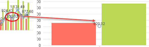
and +677 and -57 for another
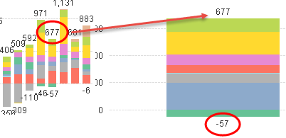
People are catching different numbers from that charts.
Please advise how to remove negative and positive values separation
Message was edited by: Yuri
- Mark as New
- Bookmark
- Subscribe
- Mute
- Subscribe to RSS Feed
- Permalink
- Report Inappropriate Content
Can you please provide sample data or application?
- Mark as New
- Bookmark
- Subscribe
- Mute
- Subscribe to RSS Feed
- Permalink
- Report Inappropriate Content
Added to topic
- Mark as New
- Bookmark
- Subscribe
- Mute
- Subscribe to RSS Feed
- Permalink
- Report Inappropriate Content
from the example you sent, it looks like the negative values in the charts containing the 2 dimensions are what is causing the diffence - If you take the negative numbers into account, the appear to match the bar charts that are only using the date dimesnion.
It appears when you select values on data point, it has 2 values - positive and negative - the 2 added together provide the correct total result
If you use a fast change to a pivot tabe for the object containing the 2 dimension and show subtotals, you will see tghat the numbers match to the bar chart on the bottom
- Mark as New
- Bookmark
- Subscribe
- Mute
- Subscribe to RSS Feed
- Permalink
- Report Inappropriate Content
I know. So people
- will have ready to use number for dates w/o negatives
- or must calculate if it is
too complicated for end user
- Mark as New
- Bookmark
- Subscribe
- Mute
- Subscribe to RSS Feed
- Permalink
- Report Inappropriate Content
You can submit a case to Qlik and let them know that when negative numbers are involved the data points are at both positive and negative and does not reflect the true total.
for the mean time, you can use a fast change to a pivot and they can see that the numbers are the same
or possibly try using the absolute value in the expression - that would possibly remove the negative issue