Unlock a world of possibilities! Login now and discover the exclusive benefits awaiting you.
- Qlik Community
- :
- All Forums
- :
- QlikView App Dev
- :
- Stacked Bar with Grouping of Dimentions
- Subscribe to RSS Feed
- Mark Topic as New
- Mark Topic as Read
- Float this Topic for Current User
- Bookmark
- Subscribe
- Mute
- Printer Friendly Page
- Mark as New
- Bookmark
- Subscribe
- Mute
- Subscribe to RSS Feed
- Permalink
- Report Inappropriate Content
Stacked Bar with Grouping of Dimentions
Hi Experts,
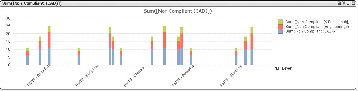
I need to create a stacked bar with two dimensions. 
This one is just a sample graph I have created in excel and made changes according to my requirement in paint. But I need to depict the same in Qlikview. I tried to add those two dimensions one after other while creating the graph but its not giving me the required result. Also I want to group them (make them separate) according to Level 1 dimension.
Thanks in Advance,
Abhijit
- « Previous Replies
-
- 1
- 2
- Next Replies »
- Mark as New
- Bookmark
- Subscribe
- Mute
- Subscribe to RSS Feed
- Permalink
- Report Inappropriate Content
Combination of trellis and stacked bar chart
- Mark as New
- Bookmark
- Subscribe
- Mute
- Subscribe to RSS Feed
- Permalink
- Report Inappropriate Content
I guess this helps.
- Mark as New
- Bookmark
- Subscribe
- Mute
- Subscribe to RSS Feed
- Permalink
- Report Inappropriate Content
Thank You Varsha for your reply.
Do you have any sample for the same? I didn't get the technique you mentioned.
Abhijit
- Mark as New
- Bookmark
- Subscribe
- Mute
- Subscribe to RSS Feed
- Permalink
- Report Inappropriate Content
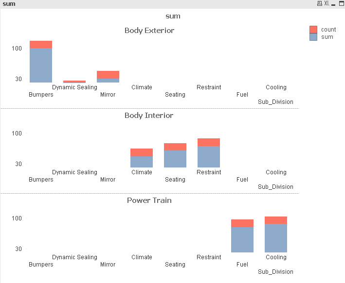
Hi Vonoth,
The sample you shared could have acted as a perfect solution but somehow its not working with my data. I don't know how does the data plays the role in this but sometimes it gives you the anticipated graph. In my case I tried with the exact approach you shared, but I am getting weird graph. Qlikview doesn't always like multi-dimensions in bar graph.
See I am getting something like this:
I read lot of posts regarding this. I came to the conclusion that we can't build it with multi dimensions.
Abhijit
- Mark as New
- Bookmark
- Subscribe
- Mute
- Subscribe to RSS Feed
- Permalink
- Report Inappropriate Content
I think you are experiencing a difficult situation there, but if you could share your .qvw file I may help
And my name is vinoth not vonoth
- Mark as New
- Bookmark
- Subscribe
- Mute
- Subscribe to RSS Feed
- Permalink
- Report Inappropriate Content
I just tried one,
But it looks like this,
- Mark as New
- Bookmark
- Subscribe
- Mute
- Subscribe to RSS Feed
- Permalink
- Report Inappropriate Content
IS THIS OKAY ?
- Mark as New
- Bookmark
- Subscribe
- Mute
- Subscribe to RSS Feed
- Permalink
- Report Inappropriate Content
share the sample app with description of your requirement..that will help you in suggesting the solution
- Mark as New
- Bookmark
- Subscribe
- Mute
- Subscribe to RSS Feed
- Permalink
- Report Inappropriate Content
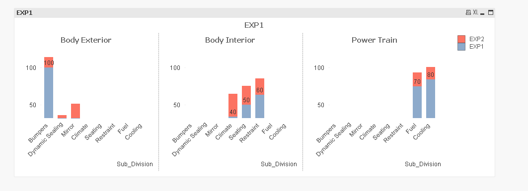
Hi Varsha,
Thank you for your response. It's quite close to my requirement. Please have a look at the graph below:
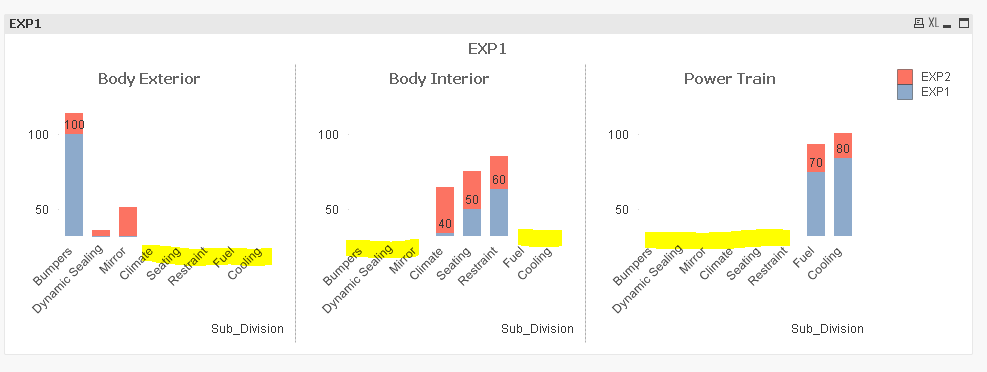
If you see the highlighted portion, that's not a part of that particular higher level dimension. So we shouldn't include that one. In real time data I will be having 5-6 subdivisions for each of the 5 divisions. Visually it would be too messy to show all the subdivision irrespective of its relation with higher level dimension. Will it be a correct approach adding two dimensions for chart? Sometimes it will give results sometimes QV doesn't like to work with multiple dimensions in chart.
But I really like your approach towards the problem. How did you get that doted partition?
Abhijit
- « Previous Replies
-
- 1
- 2
- Next Replies »