Unlock a world of possibilities! Login now and discover the exclusive benefits awaiting you.
- Qlik Community
- :
- All Forums
- :
- QlikView App Dev
- :
- Struggling with formulas in charts
- Subscribe to RSS Feed
- Mark Topic as New
- Mark Topic as Read
- Float this Topic for Current User
- Bookmark
- Subscribe
- Mute
- Printer Friendly Page
- Mark as New
- Bookmark
- Subscribe
- Mute
- Subscribe to RSS Feed
- Permalink
- Report Inappropriate Content
Struggling with formulas in charts
Hello,
This is a great community! Thanks everyone.
I have a sales table like this -
| Product | Qty | RRP (total) | Sale Price (total) |
|---|---|---|---|
| Product A | 2 | 200 | 160 |
| Product B | 1 | 50 | 45 |
| Product C | 2 | 150 | 120 |
| Product A | 1 | 100 | 70 |
I am trying to create a chart to find the best discount for products.
I think the best way is to show it this way -
x- axis - Discount
y- axis - products sold at this discount.
I might need to use ranges (0-10%, 10%-20%, etc ) as discounts are usually 5-10-15-20-25. I am not sure at this point how to do it.
Could someone give me an idea what dimensions, expressions I should use for line chart, or if it should be line chart at all? Or maybe there is a better way to use QV to find the best discounts using the data I have?
Thanks.
- Tags:
- new_to_qlikview
Accepted Solutions
- Mark as New
- Bookmark
- Subscribe
- Mute
- Subscribe to RSS Feed
- Permalink
- Report Inappropriate Content
Hi.
You could use round()/floor() or class() function in dimension to have 'baskets' instead of separate values:
=floor([Discount percent], 0.01)
or
=aggr(class([Discount percent], 'x', 0.01), _put here dimension that represens the selling_)
The first one can also be used in script.
In addition you could change the text format with num() to have percents:
=num(floor([Discount percent], 0.01), '0%')
- Mark as New
- Bookmark
- Subscribe
- Mute
- Subscribe to RSS Feed
- Permalink
- Report Inappropriate Content
Maybe with a bar chart like in the attached example.
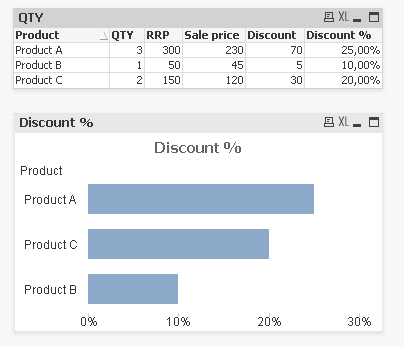
talk is cheap, supply exceeds demand
- Mark as New
- Bookmark
- Subscribe
- Mute
- Subscribe to RSS Feed
- Permalink
- Report Inappropriate Content
I would suggest you calculate the discount at the script level, and then use that field as your dimension. Your expression would be sum(Qty)
- Mark as New
- Bookmark
- Subscribe
- Mute
- Subscribe to RSS Feed
- Permalink
- Report Inappropriate Content
Thanks Gysbert, but I don't think it's how I wanted to analyse my data.
I have the same product (RRP - 100$) sold with different prices -
Like this -
1 units for 100$
2 units for 90$ each
3 units for 80$ each
11 units for 80$ each
9 units for 80$ each
35 units for 70$ each.
This is a table I have.
Now I need to
1) Group the table above by sale price
1 units for 100$
5 units for 90$ each
20 units for 80$ each
35 units for 70$ each.
2) Show a bar chart similar to what you made but with Discounts (0%, 10%, 20%, 30%) instead of products.
- Mark as New
- Bookmark
- Subscribe
- Mute
- Subscribe to RSS Feed
- Permalink
- Report Inappropriate Content
thanks orsh, I tried that, but it shows some discounts of 12000%. I most likely made a mistake in discount formula. Trying to fix now.
- Mark as New
- Bookmark
- Subscribe
- Mute
- Subscribe to RSS Feed
- Permalink
- Report Inappropriate Content
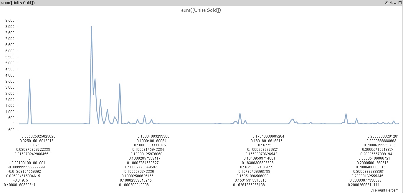
Hi orsh,
Thanks!!!
Your approach works in general, but I have 2 problems -
1) (easy) my discounts are not shown as percents - it's a dimension on the graph as you recommended.
2) as you can see on the picture 10% is not exactly 10% it's sometimes 10.000001%, sometimes 9.9999%, so I need to somehow show them as the same thing.
- Mark as New
- Bookmark
- Subscribe
- Mute
- Subscribe to RSS Feed
- Permalink
- Report Inappropriate Content
Hi.
You could use round()/floor() or class() function in dimension to have 'baskets' instead of separate values:
=floor([Discount percent], 0.01)
or
=aggr(class([Discount percent], 'x', 0.01), _put here dimension that represens the selling_)
The first one can also be used in script.
In addition you could change the text format with num() to have percents:
=num(floor([Discount percent], 0.01), '0%')