Unlock a world of possibilities! Login now and discover the exclusive benefits awaiting you.
- Qlik Community
- :
- All Forums
- :
- QlikView App Dev
- :
- Text label in a bar chart
- Subscribe to RSS Feed
- Mark Topic as New
- Mark Topic as Read
- Float this Topic for Current User
- Bookmark
- Subscribe
- Mute
- Printer Friendly Page
- Mark as New
- Bookmark
- Subscribe
- Mute
- Subscribe to RSS Feed
- Permalink
- Report Inappropriate Content
Text label in a bar chart
Hi friends,
Need your help here.
I have a table
| Type | Output % | Output |
| A | 99% | (0.9) |
| A XYZ | 96% | (0.6) |
| B | 87% | (9.6) |
| B XYZ | 94% | (0.5) |
| C | 96% | (1.0) |
| C XYZ | 93% | (0.3) |
| D | 101% | 0.2 |
| D XYZ | 96% | (0.1) |
| E | 93% | (0.9) |
| E XYZ | 78% | (0.2) |
| F | 99% | (0.5) |
| F XYZ | 99% | (0.0) |
| G | 96% | (12.6) |
| G XYZ | 95% | (1.7) |
Now i need to make a bar chart like this as shown in the image attached.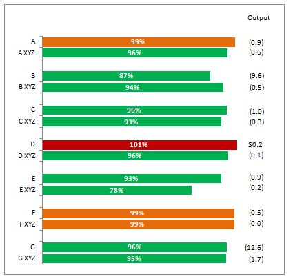
Challenges
1. It is very simple to create a percentage bar chart, but how to populate the numbers on the right side. This was a text box in excel chart. Is there any way by which we can show this additional information Output in bar chart.
2. Between different type segments, there should be adequate amount of space. Is that possible in qlikview?
Looking for your answers.
Thanks in advance.
Regards,
Kuldeep
- Tags:
- new_to_qlikview
- Mark as New
- Bookmark
- Subscribe
- Mute
- Subscribe to RSS Feed
- Permalink
- Report Inappropriate Content
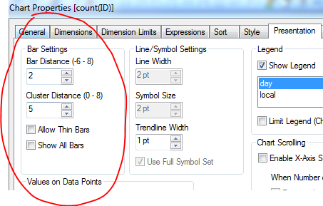
1. You can use text on axis (expression tab) for that but it will be put on the left not on the right as you require. If you use text (presentation tab) then by clicking cntrl + shift you can adjust the position on the chart. Not advisable though, as expressions might be dynamic and change position.
2. Presentation tab, experiment with the bar settings :
- Mark as New
- Bookmark
- Subscribe
- Mute
- Subscribe to RSS Feed
- Permalink
- Report Inappropriate Content
Hey thanks bro,
But after doing lots of research i am still not able to get it.
Regards,
Kuldeep
- Mark as New
- Bookmark
- Subscribe
- Mute
- Subscribe to RSS Feed
- Permalink
- Report Inappropriate Content
post a sample app if possble
- Mark as New
- Bookmark
- Subscribe
- Mute
- Subscribe to RSS Feed
- Permalink
- Report Inappropriate Content
You can probably represent in a straight table with a linear Gauge Expression