Unlock a world of possibilities! Login now and discover the exclusive benefits awaiting you.
- Qlik Community
- :
- All Forums
- :
- QlikView
- :
- ToolTip issues in Bar Chart
- Subscribe to RSS Feed
- Mark Topic as New
- Mark Topic as Read
- Float this Topic for Current User
- Bookmark
- Subscribe
- Mute
- Printer Friendly Page
- Mark as New
- Bookmark
- Subscribe
- Mute
- Subscribe to RSS Feed
- Permalink
- Report Inappropriate Content
ToolTip issues in Bar Chart
Hi all,
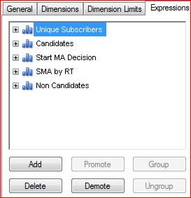
This is the expressions I created for a specific chart:
This is how it looks in the chart tooltip:
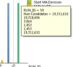
Why aren't they in the same order?
why does the Non candidates duplicate itself?
and why don't I see the name like in the Non Candidates?
Please Assist,
Boris
- « Previous Replies
-
- 1
- 2
- Next Replies »
- Mark as New
- Bookmark
- Subscribe
- Mute
- Subscribe to RSS Feed
- Permalink
- Report Inappropriate Content
Hi John,
This is an old post but i was facing a similar problem but in the Maps of Qlik Sense. I have 4 different metrics say M1, M2, M3 and M4. My tool tip will show these 4 metrics for 3 wholesalers (who are sitting in one zip code). Now, My tooltip will show the information about these 4 metrics for these 3 wholesalers. I want to sort the information on the basis of wholesaler (lets say W1 -red, W2 - yellow, W3 -green).
Please suggest
- Mark as New
- Bookmark
- Subscribe
- Mute
- Subscribe to RSS Feed
- Permalink
- Report Inappropriate Content
I'm not sure I follow what you are asking for. Can you post a sample file or a picture of what you mean?
--john
- « Previous Replies
-
- 1
- 2
- Next Replies »