Unlock a world of possibilities! Login now and discover the exclusive benefits awaiting you.
- Qlik Community
- :
- All Forums
- :
- QlikView App Dev
- :
- Translating Excel Conditional Format to Qlik Expre...
- Subscribe to RSS Feed
- Mark Topic as New
- Mark Topic as Read
- Float this Topic for Current User
- Bookmark
- Subscribe
- Mute
- Printer Friendly Page
- Mark as New
- Bookmark
- Subscribe
- Mute
- Subscribe to RSS Feed
- Permalink
- Report Inappropriate Content
Translating Excel Conditional Format to Qlik Expression Representation
Qlik World,
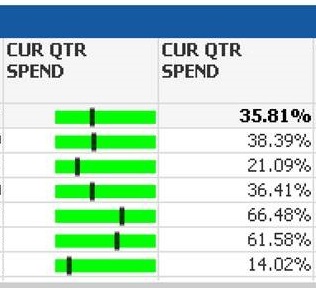
I am in the process of translating an Excel pivot table into a comparable Qlikview version. Most of the work has been done, but I want to see if there is a way to make the two versions match better:
Excel: QlikView:
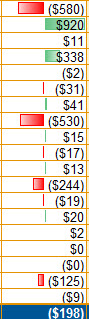
Is there another option in Qlik that is closer to the Excel formatting? The Excel is a PivotTable using the Conditional Formatting/DataBars option. The QlikView is using a linear gauge.
Thanks for any help you can provide!
- Mark as New
- Bookmark
- Subscribe
- Mute
- Subscribe to RSS Feed
- Permalink
- Report Inappropriate Content
Hi Jordan,
There is a work around through this, you can change the background of the cell using Visual Cues option.
I am attaching a demo app for your reference.
Regards,
Akshaya
- Mark as New
- Bookmark
- Subscribe
- Mute
- Subscribe to RSS Feed
- Permalink
- Report Inappropriate Content
Thank you, Akshaya! I will try this out soon and report back how it works.
- Mark as New
- Bookmark
- Subscribe
- Mute
- Subscribe to RSS Feed
- Permalink
- Report Inappropriate Content
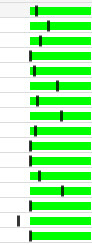
This didn't quite solve the issue as the color condition isn't the focus. There doesn't seem to be a Qlik equivalent metric view where a value can be included in the minichart as it appears in Excel. That's more the end result we were seeking; otherwise we would have to have two columns like such to display the data both in minichart and numerical value: