Unlock a world of possibilities! Login now and discover the exclusive benefits awaiting you.
- Qlik Community
- :
- All Forums
- :
- QlikView App Dev
- :
- Trend Line with Projection
- Subscribe to RSS Feed
- Mark Topic as New
- Mark Topic as Read
- Float this Topic for Current User
- Bookmark
- Subscribe
- Mute
- Printer Friendly Page
- Mark as New
- Bookmark
- Subscribe
- Mute
- Subscribe to RSS Feed
- Permalink
- Report Inappropriate Content
Trend Line with Projection
I have been trying to work up a chart that will show the daily values as bars and then the cummulating trend until the end of the month. Following the many helpful examples in the community I've made some progress but still the trend lines on the chart are going in the wrong direction.
My data has more set analysis etc. in it but I created the attached simplified version with the data points in it and the calculation that I'm using and it effectively replicates the issue.
Any thoughts on this would be very helpful.
Thanks,
Lorna
Accepted Solutions
- Mark as New
- Bookmark
- Subscribe
- Mute
- Subscribe to RSS Feed
- Permalink
- Report Inappropriate Content
I'm still not sure I have my head wrapped around what you're trying to achieve, and that formula is just too long to even try and parse out.
Here's how I'd handle what I *think* you want to do, based on what I *think* your data format is. Note that I've done exactly what I posted above, but I made the X-axis continuous (Axes tab) and unchecked "Suppress Zero-values" (Presentation Tab). I've included a second graph which uses the Forecast option (Axes tab), which may be more appropriate if you do not have auto-generated future dates (You can select "Jan1" to see how it works with partial data). Hopefully this helps - unfortunately, I am not able to help with the avenue of approach you've gotten from the linked thread, as I've never tried using that particular mechanism.
- Mark as New
- Bookmark
- Subscribe
- Mute
- Subscribe to RSS Feed
- Permalink
- Report Inappropriate Content
I'm not entirely sure why you've gone with this particular solution, so I'm a little loathe to suggest a more simple approach that may not be relevant - but in your use-case, would you be able to use QlikView's built-in accumulation function? If that's the case, all you need to do is Sum(Data) in expression, select "Full accumulation", and add a trend line. No second expression would be necessary.
- Mark as New
- Bookmark
- Subscribe
- Mute
- Subscribe to RSS Feed
- Permalink
- Report Inappropriate Content
Thanks for checking it out orsh_ . Simple solutions are my favourite and it wouldn't be the first time I unnecessarily over-complicated something!
In my real situation I don't have data for the rest of the month so when I try and use the set up that you suggested the chart cuts off where the data ends. I have a date island for the date that I'm working with so I can get the rest of the month on the chart.
I'm not sure why but when I enable the expression below for cummulation, then the rest of the month trend line appears? Without this expression enabled I only get the line for as many dates as I actually have data.
=RangeSum(above(Sum({1<MY_legal_approved_date={'$(vCurrentMonthyear)'}>}value_disc),0,rowno()))
In an ideal world I would have the actual accummulation line and then the trend line only starting after the actual data ends. I saw some examples of this but since i couldn't get the basics working I abandoned that idea.
- Mark as New
- Bookmark
- Subscribe
- Mute
- Subscribe to RSS Feed
- Permalink
- Report Inappropriate Content
I'm still trying to sort through this and feel that I'm pretty close.
This thread in particular has been very helpful: http://community.qlik.com/thread/16846
I have found that because I'm trying to perform this trend on a daily basis for the days in a month the inclusion of the weekends is making the trend part not calculate properly. I've tried doing set analysis to exclude weekends but it didn't help. I've attached a spreadsheet showing the calculation results from having the daily sum, an accumulating line for the sum and then the trend calculation results. The trend and the cummulation should match up until we're beyond today. After that the calculation seems to attributing the prior 0 value days to the calculation so the trend line ends up falling off to zero.
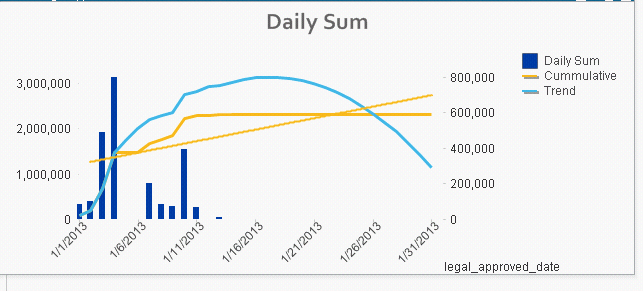
This is the formula that I'm using for the trend. Thanks for any insight!
Lorna
if(Sum({1<MY_legal_approved_date={'$(vCurrentMonthyear)'}>}total_acv_term_with_disc)
,Sum({1<MY_legal_approved_date={'$(vCurrentMonthyear)'}>}total_acv_term_with_disc)
,linest_m(total aggr(if(Sum({1<MY_legal_approved_date={'$(vCurrentMonthyear)'}>}total_acv_term_with_disc)
,Sum({1<MY_legal_approved_date={'$(vCurrentMonthyear)'}>}total_acv_term_with_disc)
),legal_approved_date),legal_approved_date)*only({1<MY_legal_approved_date={'$(vCurrentMonthyear)'}>}legal_approved_date)
+linest_b(total aggr(if(Sum({1<MY_legal_approved_date={'$(vCurrentMonthyear)'}>}total_acv_term_with_disc)
,Sum({1<MY_legal_approved_date={'$(vCurrentMonthyear)'}>}total_acv_term_with_disc)
),legal_approved_date),legal_approved_date))
- Mark as New
- Bookmark
- Subscribe
- Mute
- Subscribe to RSS Feed
- Permalink
- Report Inappropriate Content
The spreadsheet.
Thanks,
Lorna
- Mark as New
- Bookmark
- Subscribe
- Mute
- Subscribe to RSS Feed
- Permalink
- Report Inappropriate Content
I'm still not sure I have my head wrapped around what you're trying to achieve, and that formula is just too long to even try and parse out.
Here's how I'd handle what I *think* you want to do, based on what I *think* your data format is. Note that I've done exactly what I posted above, but I made the X-axis continuous (Axes tab) and unchecked "Suppress Zero-values" (Presentation Tab). I've included a second graph which uses the Forecast option (Axes tab), which may be more appropriate if you do not have auto-generated future dates (You can select "Jan1" to see how it works with partial data). Hopefully this helps - unfortunately, I am not able to help with the avenue of approach you've gotten from the linked thread, as I've never tried using that particular mechanism.
- Mark as New
- Bookmark
- Subscribe
- Mute
- Subscribe to RSS Feed
- Permalink
- Report Inappropriate Content
Thanks for your help orsh__.
I've adapted my chart based on your suggestions.
Lorna