Unlock a world of possibilities! Login now and discover the exclusive benefits awaiting you.
- Qlik Community
- :
- All Forums
- :
- QlikView App Dev
- :
- Use group & stack in dimension
- Subscribe to RSS Feed
- Mark Topic as New
- Mark Topic as Read
- Float this Topic for Current User
- Bookmark
- Subscribe
- Mute
- Printer Friendly Page
- Mark as New
- Bookmark
- Subscribe
- Mute
- Subscribe to RSS Feed
- Permalink
- Report Inappropriate Content
Use group & stack in dimension
Hi All
I want to convert bellow's first chart style to the second one:
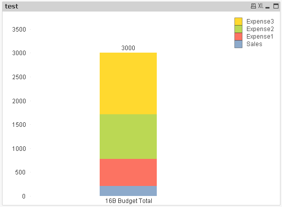
Separate Sales number and keep Expense number(expensive1, expensive2, expensive3) stack, seems like combine group and stack style.
You can see in my QVW file, I create If function in dimension to filter the category what I want.
The expression is to get the latest data.
However, I didn't find a way to make the chart display the data like the second chart.
Does someone could give me a suggestion to work it out.
Thx...
Accepted Solutions
- Mark as New
- Bookmark
- Subscribe
- Mute
- Subscribe to RSS Feed
- Permalink
- Report Inappropriate Content
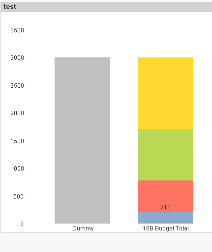
I got the solution, just create one table in script to sort type, the chart will separate Sales from Expense.
- Mark as New
- Bookmark
- Subscribe
- Mute
- Subscribe to RSS Feed
- Permalink
- Report Inappropriate Content
I assume, Rather creating If condition in UI you can do same in script. And then call them it as ValueList() then look into the Iv condition with ValueList() option to get output
- Mark as New
- Bookmark
- Subscribe
- Mute
- Subscribe to RSS Feed
- Permalink
- Report Inappropriate Content
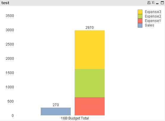
what is the expression for the grey bar?
If a post helps to resolve your issue, please accept it as a Solution.
- Mark as New
- Bookmark
- Subscribe
- Mute
- Subscribe to RSS Feed
- Permalink
- Report Inappropriate Content
See attached
If a post helps to resolve your issue, please accept it as a Solution.
- Mark as New
- Bookmark
- Subscribe
- Mute
- Subscribe to RSS Feed
- Permalink
- Report Inappropriate Content
Hi Vineeth
I adjust the second chart in my original topic, I want to display Sales data in one bar, and display all of the Expense data(expensive1, 2, 3) in another one.
I checked your expression, seems you fix the condition, like '16B Budget Total', but in my actual environment, this field will contain more conditions, like '16B Budget Total, 17A Budget Total, 17B Budget Total' and so on. It will be very complex to write the expression.
I just wonder based on my expression, whether I can create chart like the second style as I pasted.
- Mark as New
- Bookmark
- Subscribe
- Mute
- Subscribe to RSS Feed
- Permalink
- Report Inappropriate Content
Can you post a sample that best represents what you are working with?
also can you write the expression for the grey bar?
If a post helps to resolve your issue, please accept it as a Solution.
- Mark as New
- Bookmark
- Subscribe
- Mute
- Subscribe to RSS Feed
- Permalink
- Report Inappropriate Content
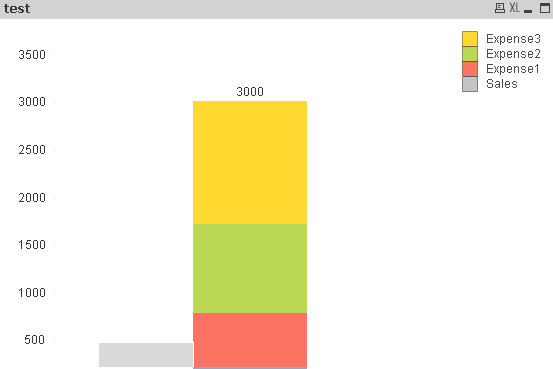
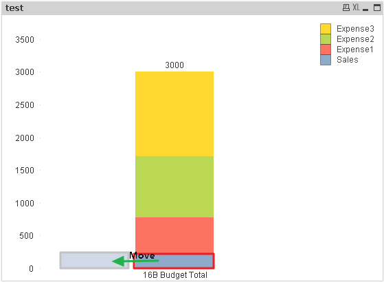
The second chart I didn't work out, so I just use PS for reference.
As bellow's pic, I want to move Sales data outside, not stack all of the expensive and sales data together.
- Mark as New
- Bookmark
- Subscribe
- Mute
- Subscribe to RSS Feed
- Permalink
- Report Inappropriate Content
I got the solution, just create one table in script to sort type, the chart will separate Sales from Expense.