Unlock a world of possibilities! Login now and discover the exclusive benefits awaiting you.
- Qlik Community
- :
- All Forums
- :
- QlikView App Dev
- :
- Variable X-axis
- Subscribe to RSS Feed
- Mark Topic as New
- Mark Topic as Read
- Float this Topic for Current User
- Bookmark
- Subscribe
- Mute
- Printer Friendly Page
- Mark as New
- Bookmark
- Subscribe
- Mute
- Subscribe to RSS Feed
- Permalink
- Report Inappropriate Content
Variable X-axis
I have a dataset that I want to graph, for instance 'number of occurances / month', where a month without occurances should still show up.
I have created a master calendar for the date-field.
I have a set of data ranging from 2013 to today (jan 2016).
I have created variables for the current and previous year
Now I'm running into some problems when I try to graph out my occurances per month, since I want to also show the months where no occurances happened;
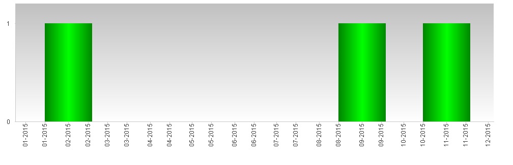
- When I set the x-axis to continuous, I have to use a date-value (so for instance '=Month(DateField)') to graph on the X-axis instead of the MonthYear field from my master calendar. In this graph I can't get the X-axis labelled correctly (since it labels dates, I can't get the label to perfectly match with the bars on my graph (example1)
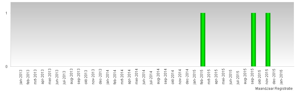
- When I use the MonthYear field from my master calendar, I can either;
- Show all values; which shows the values from 2013-2016 (example2)
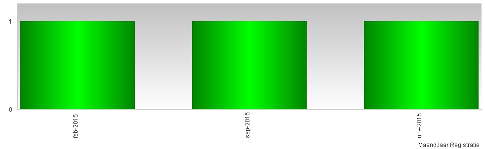
- Not show all values; but now the months without occurances are hidden (example3)
I would like a graph that looks like example1 (but works and labels with the MonthYear from my mastercalendar), or like example2, but then I would love to be able to set the graph to only show MonthYears that fall into the 2 variables (varCurrentYear and varPreviousYear) that I've set up.
What's the best way to approach this?
example1:
example2:
example3:
- « Previous Replies
-
- 1
- 2
- Next Replies »
- Mark as New
- Bookmark
- Subscribe
- Mute
- Subscribe to RSS Feed
- Permalink
- Report Inappropriate Content
The graphs you show do exactly what I want them to do.
I'm trying to reproduce them in my own model, but I can't get the months without data points to show in my graphs, even when I'm almost 100% sure I have all of the settings in the graph set exactly them same as yours.
I'm starting to think that the months without data points need to have a value of zero for them to show up, is this what you're doing with the '....value*(InCurentYear+InPreviousYear)' clause in the set analysis formula?
When I get the time I'll try to reproduce the problem I have in a small QlikView example that I'll upload. That might make troubleshooting this easier.
To be continued when work permits.
EDIT:
I found out the problem lies in the fact that I'm using more set analysis selections to grab the data I want to graph.
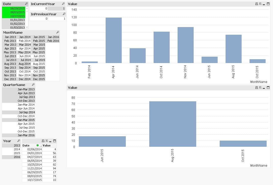
If I select a couple of points (dates) from the set you provided in your exampe I get the same graphs as I'm getting in my own model; only the months for the data points selected will show on the bar graph; screenshot from the example you included.
So I'm guessing this method doesn't work since I'm making additional selections in my set analysis?
- Mark as New
- Bookmark
- Subscribe
- Mute
- Subscribe to RSS Feed
- Permalink
- Report Inappropriate Content
Hi Maarten,
I admin, I'm having a hard time understanding your requirement... Perhaps a small example QVW could help visualize the problem and offer some alternatives... Are you saying that you keep the dimension as Date because you want to have daily bars, but only label them with the Month name?
It sounded to me at first that you need to plot the number of occurrences per month, and that means that the bars should be monthly. In this case, Month, or MonthStart(Date) should be your Dimension, not Date.
If you post an example, I could look into it.
cheers,
Oleg Troyansky
- Mark as New
- Bookmark
- Subscribe
- Mute
- Subscribe to RSS Feed
- Permalink
- Report Inappropriate Content
This works like a charm because every selection passes through the calendar. However, I suspect that we'll be in trouble again when you add another dimension (like for example Customer) to the Facts table.
Can we resolve this by creating a huge calendar table that JOINS every other selection field value to every calendar date?
- Mark as New
- Bookmark
- Subscribe
- Mute
- Subscribe to RSS Feed
- Permalink
- Report Inappropriate Content
In set analysis, this is the same effect as you get when you simply add a listbox (e.g. Customers - see my remark below) that refers to another dimension field connected to the Facts table. Selections in such a field (or explicitly reducing your set like you are doing) will further reduce the number of possible months. After which you get a "broken" X-axis.
There is one solution that might work. The Continuous option in your graph will be our savior if you can somehow escape from a date-based X-axis (too many identical labels and bar positions that are out of line). Try this:
In your calendar LOAD, create an additional dual field (call it for example MonthYearSeq) that combines your preferred MonthYear formatting with a sequential integer that numbers each month from the first on. If you start for example on 1/1/2012, then jan-2012 will have nr 1, jan-2013 will have nr 13 and so on. The value range isn't particularly important, but the succession is. An example:
:
dual( date(DateFiueld, 'MMM-YYYY',
(Year(DateField)-vFirstYear)*12+Month(DateField)) AS MonthYearSeq,
:
IMHO, if you use this field as dimension in a continous X-axis, you will get the months without data in addition to making the timeline immune to other selections. Only one remaining problem: formatting the X-axis labels. (sorry, cannot test this out, no Desktop at the moment)
Another solution that has none of the disadvantages consists of adding so called zero-records to your facts table. They won't show up anywhere, and if you disable "Suppress zero values" in a standard chart, you will get a continuous timeline without any tricks. Be careful to create zero-records for all missing selection field/set analysis combinations, or your selections may again reduce the calendar...
Best,
Peter
- Mark as New
- Bookmark
- Subscribe
- Mute
- Subscribe to RSS Feed
- Permalink
- Report Inappropriate Content
Thanks, I was afraid that this was the case.
I'll tinker around with with the two suggestions you mentioned. I'll update here if I find that one works well.
It would be so useful to have the option to input values like 'week' or 'month' in the static step box for the continuous x-axis...
- « Previous Replies
-
- 1
- 2
- Next Replies »