Unlock a world of possibilities! Login now and discover the exclusive benefits awaiting you.
- Qlik Community
- :
- All Forums
- :
- QlikView App Dev
- :
- Visual Cue based on specific data
- Subscribe to RSS Feed
- Mark Topic as New
- Mark Topic as Read
- Float this Topic for Current User
- Bookmark
- Subscribe
- Mute
- Printer Friendly Page
- Mark as New
- Bookmark
- Subscribe
- Mute
- Subscribe to RSS Feed
- Permalink
- Report Inappropriate Content
Visual Cue based on specific data
My data looks like this:
Region, Sitename, Time, Target
I then pivot this to give me the average time per site (using Region as a filter with a straight forward list box)
I now need "Target" to fire a visual cue (green or red). Target for a site won't change, so for "Site 1" the target will always be "x"
Simply adding "=Target" to the visual cue doesn't seem to work.
Any ideas?
Accepted Solutions
- Mark as New
- Bookmark
- Subscribe
- Mute
- Subscribe to RSS Feed
- Permalink
- Report Inappropriate Content
Here:
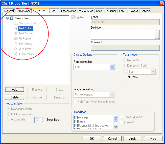
And in the definition box for Text Colour, enter (slight change to simplify the process):
=If(Time > Target, LightRed(), Green())
Vary the colours to your preferences. The colour can also be in the form RGB(redvalue, greenvalue, bluevalue) if the standard colours dont fit.
Regards
Jonathan
- Mark as New
- Bookmark
- Subscribe
- Mute
- Subscribe to RSS Feed
- Permalink
- Report Inappropriate Content
Hi
Please explain more clearly the conditions for cue to be green and the conditions for red.
Regards
Jonathan
- Mark as New
- Bookmark
- Subscribe
- Mute
- Subscribe to RSS Feed
- Permalink
- Report Inappropriate Content
Hi Jonathan,
The data looks like this:
Region, Site, Time (minutes), Target (minutes)
London, Heathrow, 45, 30
London, Heathrow, 40, 30
London, Heathrow, 30, 30
France, Paris, 5, 20
London, Heathrow, 25, 30
London, Heathrow, 60, 30
France, Paris, 25, 20
France, Paris, 15, 20
London, Heathrow, 12, 30
The target is unique to each site, so will always be 30 (for London) and 20 (for France) unless someone changes it in the database (making this dynamic)
I have a pivot table that looks like this:
Heathrow | Paris
Average x | y
The visual cue should fire red if Heathrow is >= the target (which is 30), and it should fire red if Paris is >= 20. The rest of the time it should show green.
This is a simplified example of what I'm working with. The site name's are all dynamic including the targets per site name. Can't hardcode anything into the report otherwise each time someone add something into the database (new site name) I have to go edit the report. I don't know about you, but I don't like lots of work 
Thanks for your help!
- Mark as New
- Bookmark
- Subscribe
- Mute
- Subscribe to RSS Feed
- Permalink
- Report Inappropriate Content
Hi
I don't think that visual cues are the right solution for your requirement - I am not sure that the conditions are evaluated row by row.. Perhaps you would be better off using conditional formatting. Make the default golor green, and then click the + sign next to the expression and enter the conditional colour expression for Text_Color. Something like:
=If(Time > Target, LightRed())
Hope that helps
Jonathan
- Mark as New
- Bookmark
- Subscribe
- Mute
- Subscribe to RSS Feed
- Permalink
- Report Inappropriate Content
Thanks, yes, the average values (derived from an expression) for each site changes. Where do I go to make the default colour green and where is the plus sign?
So far all I can see on Chart Properties is a bunch of layout options and the only one that has given me the ability to do some form of change on the background color per row was Visual Cues.
Sorry if this is very n00b
- Mark as New
- Bookmark
- Subscribe
- Mute
- Subscribe to RSS Feed
- Permalink
- Report Inappropriate Content
Here:
And in the definition box for Text Colour, enter (slight change to simplify the process):
=If(Time > Target, LightRed(), Green())
Vary the colours to your preferences. The colour can also be in the form RGB(redvalue, greenvalue, bluevalue) if the standard colours dont fit.
Regards
Jonathan
- Mark as New
- Bookmark
- Subscribe
- Mute
- Subscribe to RSS Feed
- Permalink
- Report Inappropriate Content
It's almost working, one thing that I think is missed in explanation is:
One region can have many sites. Each site has a target. So once you filter to one region with many sites, it seems it's using a random target for the process.
Any more ideas?
- Mark as New
- Bookmark
- Subscribe
- Mute
- Subscribe to RSS Feed
- Permalink
- Report Inappropriate Content
I think the problem might be legacy related (I took over from someone else). I think if I split the tables properly instead of having ALL the data in one table, I can do better. (If a region only has 1 site, it's usually in a different table, as soon as there's more than 1 site in that region, it has a "detail" table, don't ask WHY lol, but I think by splitting these 2, the "detail" won't dictate the "header")
We'll see if it works and I'll mark the question accordingly
- Mark as New
- Bookmark
- Subscribe
- Mute
- Subscribe to RSS Feed
- Permalink
- Report Inappropriate Content
My data is a bit of a biatch, but Jonathan helped a lot in sending me the right direction. With a bit of "nursing" the expression a bit, it worked brilliantly.