Unlock a world of possibilities! Login now and discover the exclusive benefits awaiting you.
- Qlik Community
- :
- All Forums
- :
- QlikView App Dev
- :
- Visual Cue help needed
- Subscribe to RSS Feed
- Mark Topic as New
- Mark Topic as Read
- Float this Topic for Current User
- Bookmark
- Subscribe
- Mute
- Printer Friendly Page
- Mark as New
- Bookmark
- Subscribe
- Mute
- Subscribe to RSS Feed
- Permalink
- Report Inappropriate Content
Visual Cue help needed
Hi
I have the following pivot chart:
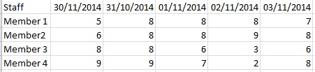
It has 2 dimensions (StaffMember & Date) , the expression is a sum(hours).
My problems is the following:
1. I have a table with every date of the year and the minimum hours is captured in it (public holidays & weekend days is marked with 0 hours), i need the dimension(date) at the top to display in blue, then any days with 0 hours needs to be a different colour.
2. My minimum hours per day worked is captured per staff member in a seperate table, i need a visual cue that can take the hours from the table then display change the colour of the values that is smaller than the minimum.
Eg: Member 1 is 7 hours per day, Member 2 is 8 hrs, Member 3 is 7 and Member 4 is 8., which means on the 30/11/2014 both the 5 & 6 should be in red
Any help will be much appreciated, all my efforts for the above has been null. I have tried running it in the visual cue tab, then i can only use one value to change colour (eg anything smaller than 😎 and the date colour change i managed but then i have to select click the date field to change it colour
Accepted Solutions
- Mark as New
- Bookmark
- Subscribe
- Mute
- Subscribe to RSS Feed
- Permalink
- Report Inappropriate Content
Hi
Click the + next to the your chart expression (in the Properties | Expression dialog), and then enter the condition in the Text Color box. You would need something like:
If(Sum(hours) = 0, LightGray(), If(Sum(hours) < MinimumHours, LightRed()))
Where MinimumHours is the staff member's minimum daily hours.
To set the header to display in blue, you will need to use custom formats.To set a custom format, turn on the design grid (View | Design Grid). Then right click on the header line and select Custom Format Cell.
HTH
Jonathan
- Mark as New
- Bookmark
- Subscribe
- Mute
- Subscribe to RSS Feed
- Permalink
- Report Inappropriate Content
Thanx that seems to have sorted my hours issue perfect, dont know how i missed it as i tried that route with alot of If statements.
ill give the custom cells a shot thanx
- Mark as New
- Bookmark
- Subscribe
- Mute
- Subscribe to RSS Feed
- Permalink
- Report Inappropriate Content
hi,
I hope you don't mind me asking a question on this matter,
i am looking to add 2 values:
=if([Last Order Date UK]<=today()-90,rgb(250,200,26),rgb(0,0,0))
=if ([Last Order Date UK]<=today()-90,rgb(255,0,0),rgb(0,0,0))
There is no error but also no return, when i add only a single line it works ok...
I am also trying to add a visual cue based on one expression to another expression so the colours follow through certain cells.
I have tried these, but they do nothing.
Only([Last Order Date UK])=today()-90
and
=[Last Order Date UK]=today()-90
There is no expression error but the colouring does not occur.
I am trying to add this to a differnt expression in the list to that for [UK Last Order Date] which obviously just works with the following:
Upper >=today()-90 Black
Normal Orange
Lower <=today()-180 Red
Thank you if you can assist with this.
Regards,
Daniel