Unlock a world of possibilities! Login now and discover the exclusive benefits awaiting you.
- Qlik Community
- :
- All Forums
- :
- QlikView App Dev
- :
- Visualise issues by location
- Subscribe to RSS Feed
- Mark Topic as New
- Mark Topic as Read
- Float this Topic for Current User
- Bookmark
- Subscribe
- Mute
- Printer Friendly Page
- Mark as New
- Bookmark
- Subscribe
- Mute
- Subscribe to RSS Feed
- Permalink
- Report Inappropriate Content
Visualise issues by location
Hi,
I'd like to be able to create a map visual that will show where there are particular feedback issues aligned to a given department in different locations. Example data would be:
| Location | Comment Type | Business Area |
|---|---|---|
| London | Positive | HR |
| London | Negative | Operations |
| London | Positive | HR |
| London | Negative | Finance |
| Birmingham | Positive | Finance |
| Birmingham | Negative | Operations |
| Birmingham | Negative | Operations |
| Birmingham | Negative | HR |
| Birmingham | Negative | Operations |
| Cardiff | Negative | Operations |
| Cardiff | Negative | Finance |
| Cardiff | Negative | Finance |
| Cardiff | Positive | Operations |
| Cardiff | Negative | HR |
I can add a filter pane to switch between negative and positive comments based on the "Comment Type" dimension but I can't work out how I can use the "Business Area" and "Location" dimensions to give me an easy graphic showing spikes of issues. An example would be the above data showing me that Operations is a concern in Birmingham and Finance is in Cardiff. (Real data has much wider spread and more lines so issues are more obvious that 1 or 2 mentions!)
Very new to Qlik and syntax in general so any help in very simple language is appreciated!
- Mark as New
- Bookmark
- Subscribe
- Mute
- Subscribe to RSS Feed
- Permalink
- Report Inappropriate Content
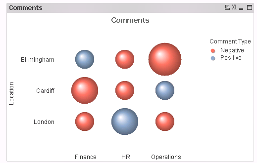
Does this help?
- Mark as New
- Bookmark
- Subscribe
- Mute
- Subscribe to RSS Feed
- Permalink
- Report Inappropriate Content
Great way of looking at it! I'd perhaps become too fixated on using a map.
Could you share how you produced that?
- Mark as New
- Bookmark
- Subscribe
- Mute
- Subscribe to RSS Feed
- Permalink
- Report Inappropriate Content
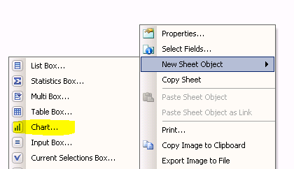
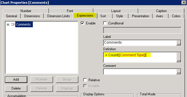
Right click - new Sheet Object - Chart
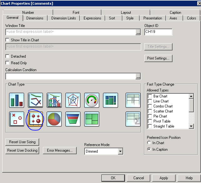
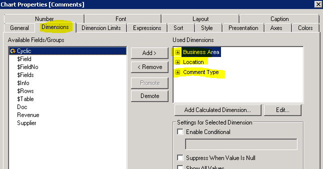
and Add a grid chart and use as below:
- Mark as New
- Bookmark
- Subscribe
- Mute
- Subscribe to RSS Feed
- Permalink
- Report Inappropriate Content
Ah, ok. I'm using Qlik Sense Desktop April 2018. Doesn't appear to have grid chart as an option.
- Mark as New
- Bookmark
- Subscribe
- Mute
- Subscribe to RSS Feed
- Permalink
- Report Inappropriate Content
Oh ok. Probably not sure may be you need to use an extension for Qliksense Grid chart. Look in Qlikbranch for any extensions.