Unlock a world of possibilities! Login now and discover the exclusive benefits awaiting you.
- Qlik Community
- :
- All Forums
- :
- QlikView App Dev
- :
- Weird things when using Aggr in Chart expression
- Subscribe to RSS Feed
- Mark Topic as New
- Mark Topic as Read
- Float this Topic for Current User
- Bookmark
- Subscribe
- Mute
- Printer Friendly Page
- Mark as New
- Bookmark
- Subscribe
- Mute
- Subscribe to RSS Feed
- Permalink
- Report Inappropriate Content
Weird things when using Aggr in Chart expression
Hi,
The best way to show what's happening here is in the attached .qvw.
I load the following data (in two inline-s):
| Date | decision | count | cust | severity |
| 1 | good | 1 | A | 0.64 |
| 1 | bad | 3 | B | 0.22 |
| 2 | bad | 2 | C | 0.12 |
| 2 | good | 2 | A | 0.38 |
| 2 | good | 9 | B | 0.09 |
| 3 | bad | 9 | C | 0.42 |
| 3 | good | 3 | A | 0.85 |
| 4 | good | 10 | C | 0.25 |
| 4 | bad | 10 | A | 0.21 |
| 4 | bad | 3 | C | 0.17 |
| 5 | bad | 3 | C | 0.7 |
| 5 | good | 10 | A | 0.81 |
| 5 | good | 10 | B | 0.95 |
| 6 | bad | 0 | A | 0.55 |
And plot a chart, where Date is the dimension and the expression is:
=sum(aggr(
sum(if(decision='good',count)) * sqrt(sum(severity))
,custId))
The expression is so it must use the aggr expression in order to calculate correctly.
Now, as can be seen in the qvw, the chart is really wired (some dates are missing...):
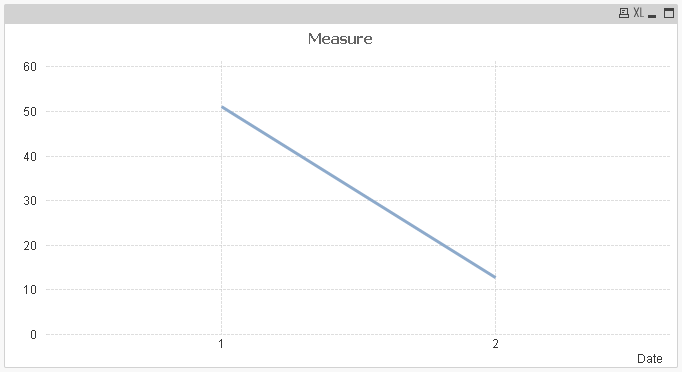
what causes this behavior?
How can I deal with it?
Thanks!
Accepted Solutions
- Mark as New
- Bookmark
- Subscribe
- Mute
- Subscribe to RSS Feed
- Permalink
- Report Inappropriate Content
Hi Amalin, if you do aggr only by custID, it keeps only these two dates because in next dates doesn't appears any new cust, you can try with:
=sum(aggr(
sum(if(decision='good',count)) * sqrt(sum(severity))
,Date,custId))
Check attachment and look if that's what you want.
- Mark as New
- Bookmark
- Subscribe
- Mute
- Subscribe to RSS Feed
- Permalink
- Report Inappropriate Content
Go to presentation tab and untick Suppress Zero Values
- Mark as New
- Bookmark
- Subscribe
- Mute
- Subscribe to RSS Feed
- Permalink
- Report Inappropriate Content
Hi Amalin, if you do aggr only by custID, it keeps only these two dates because in next dates doesn't appears any new cust, you can try with:
=sum(aggr(
sum(if(decision='good',count)) * sqrt(sum(severity))
,Date,custId))
Check attachment and look if that's what you want.