Unlock a world of possibilities! Login now and discover the exclusive benefits awaiting you.
- Qlik Community
- :
- All Forums
- :
- QlikView
- :
- Why the legend is gray ?
- Subscribe to RSS Feed
- Mark Topic as New
- Mark Topic as Read
- Float this Topic for Current User
- Bookmark
- Subscribe
- Mute
- Printer Friendly Page
- Mark as New
- Bookmark
- Subscribe
- Mute
- Subscribe to RSS Feed
- Permalink
- Report Inappropriate Content
Why the legend is gray ?
Greetings!
This is my problem: I have a Combo Chart with quite a few expressions and dimensions. I have been using the regular color palette, however just recently I wanted to set constants colors for some of dimensions - let's say customers. Therefore I created an expression to pick RGB values for my data - and this actually worked as I wanted. What bothers me is the fact that my chart by default is being displayed with more than one expression and on this level I'm not coloring the lines by the expressions the thing is that even though the chart lines are using the default color palette - the legend is not handling this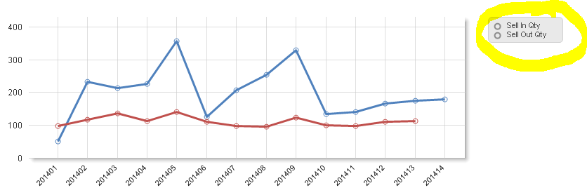
I checked that once I input in Background property of the expression any value that cannot be evaluated to valid color ( a space is best example) legend is not handling this properly, whereas the line itself picks the first color from the palette.
Any ideas / suggestions ? I have searched the community but I could not find anything similar ?
Thanks in advance for our help
Bartek
- « Previous Replies
-
- 1
- 2
- Next Replies »
- Mark as New
- Bookmark
- Subscribe
- Mute
- Subscribe to RSS Feed
- Permalink
- Report Inappropriate Content
I think the way to go here is to always return a valid color code when using the attribute expression.
How does your color expression look like?
- Mark as New
- Bookmark
- Subscribe
- Mute
- Subscribe to RSS Feed
- Permalink
- Report Inappropriate Content
ok, first of all let me give you some more details...
I use few data islands
- one : to give user an option to chose which metric(s) (e.g. Sell In Qty or Sell Out Qty as per the enclosed screen) should be displayed (if only one - as mentioned earlier by default few are being displayed); if one metric is selected then it enables more options (another data island becomes available) to split by Dimensions
- two: to give user possibility to split single metric by [Product]
therefore my expression is like this:
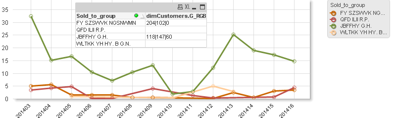
if(GetFieldSelections(Product) = 'Customer'
,if(len(dimCustomers.G_RGB)>3
,RGB( SubField(dimCustomers.G_RGB,'|',1) ,SubField(dimCustomers.G_RGB,'|',2) ,SubField(dimCustomers.G_RGB,'|',3) )
,null()
)
,null()
)
and still I'm quite happy about how the expression works, though in my opinion it is rather some issue related to how the legend object maintains or refers to the default color palette - I'm expecting that the legend should display my default color #1 and #2 - the same way chart's lines were colored.
It seems that if the Background property of the expression is used the legend object simply does not care about the default coloring whereas at the same time the expression itself is being colored from the palette. hope you are getting my point... ! !
- Mark as New
- Bookmark
- Subscribe
- Mute
- Subscribe to RSS Feed
- Permalink
- Report Inappropriate Content
I think those expression won't return a valid result and it seems qv behaves differently for the different color-parts of the chart (the reason might be the different priority which the different possiblities to customize colors have). I believe this will be helpful for you: Colors in charts.
- Marcus
- Mark as New
- Bookmark
- Subscribe
- Mute
- Subscribe to RSS Feed
- Permalink
- Report Inappropriate Content
Marcus, thanks for sharing your opinion and the link - actually I do exactly what is there described by HIC. For some reason I have the RGB in a single column with "|" as a delimiter and that is why I use the SubField function.
Anyway - I do agree that in some cases the expression will not return valid result - color, though I'm still curious why the chart line is able to get the color but the legend cannot.
I have also double checked that it this area Qlik behaves very odd, namely :
- I have checked that my RGB definition does not cover all the "Customers", however when I Select single expression and split by "Customers" then the expression evaluates to True which means the lines are colored as I wanted. As mentioned though for some of the customers the RBG definition is not in the column therefore this part of the expression len(dimCustomers.G_RGB)>3 returns False - so it goes to else part => null() which is again rather bad color definition - but surprise ... in this case Qlik is able to handle the colors from the palette
What do you say ?
- Mark as New
- Bookmark
- Subscribe
- Mute
- Subscribe to RSS Feed
- Permalink
- Report Inappropriate Content
I don't see there a real contradiction - for the chart itself it will ignore any failure within the color-expressions and return instead the colors from color-palette and by other parts like the legend (which will be differently evaluated because it's a TOTAL calculation against the x-axis) the default behaviour by errors is to grey it out.
In fact this could be quite useful to detect any errors within the expression respectively that the to fetching data are different to them what you expect.
In your case I suggest to use always an else-part within these expressions with a quite noticable color, maybe a bright pink or similar - then I think you want see errors instead of cover them.
- Marcus
- Mark as New
- Bookmark
- Subscribe
- Mute
- Subscribe to RSS Feed
- Permalink
- Report Inappropriate Content
I think this might be due to the legend setting .
Go to Chart properties>Presentation>legend Setting>make the background as transparent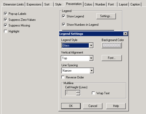
- Mark as New
- Bookmark
- Subscribe
- Mute
- Subscribe to RSS Feed
- Permalink
- Report Inappropriate Content
Hi Avinash
Sorry I was not reffering to the background of the legend -
Thanks anyway
BI
- Mark as New
- Bookmark
- Subscribe
- Mute
- Subscribe to RSS Feed
- Permalink
- Report Inappropriate Content
Hi Marcus,
It's been a while, though I was busy with some other Qlik related duties... now coming back to the problem... meanwhile I have created a simple app which describes the problem clearly.
It would be rather not possible to have a list of RGB for each an every customer. Also I cannot provide a valid color in the else part, because if is split by time & customer for those with no RGB it will always use the same color - which does not make much sense; Moreover I want to color my lines only when Customer come into picture, so if I display the chart on higher level I want to get the colors definition from the palette.
Please let me know if you have any other suggestions / hints 😃
Best Regards
BI
- Mark as New
- Bookmark
- Subscribe
- Mute
- Subscribe to RSS Feed
- Permalink
- Report Inappropriate Content
I think you couldn't display your chart in this way then you used two dimensions and two expressions within a line-chart.
A solution might be to use only one dimension and many expressions - one for each product and maybe further conditions like visibility. Common in use by various chart display-problems is to use two or more objects which overlap each other but I would rather prefer to use the line-chart in trellis-mode:
And however I wouldn't use NULL as else-part - to define own default-values for this is helpful in many things especially to find errors or unexpected results.
By your coloring might be also an opposite approach useful that all lines (or maybe bars) are generell unique (maybe in grey) and only those which are selected (or other conditions) will be highlighted through another coloring.
-Marcus
- « Previous Replies
-
- 1
- 2
- Next Replies »