Unlock a world of possibilities! Login now and discover the exclusive benefits awaiting you.
- Qlik Community
- :
- All Forums
- :
- QlikView App Dev
- :
- chart help
- Subscribe to RSS Feed
- Mark Topic as New
- Mark Topic as Read
- Float this Topic for Current User
- Bookmark
- Subscribe
- Mute
- Printer Friendly Page
- Mark as New
- Bookmark
- Subscribe
- Mute
- Subscribe to RSS Feed
- Permalink
- Report Inappropriate Content
chart help
Hi,
2 questions please with a chart (its a straight table).
Please see attached - this is the table as it stands. Can anyone highlight how:
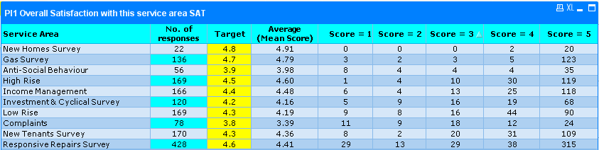
1) Whether we can make individual column headers a different colour? You will see the column 'target 15/16' where we have changed the individual rows but can't see how to do the header.
2) What the expression would be so the colour of the 'average mean score' would change dependent on whether it was a higher or lower than the target. For example as it stands New Homes 'average mean score' would be green as its higher than the 4.8 target (if it was less would want it to be red). I appreciate this is done on the visual cues tab but don't know what expression would be.
Any help would be grately appreciated.
Chris
- Tags:
- new_to_qlikview
- « Previous Replies
-
- 1
- 2
- Next Replies »
Accepted Solutions
- Mark as New
- Bookmark
- Subscribe
- Mute
- Subscribe to RSS Feed
- Permalink
- Report Inappropriate Content
| ID | Budget | Sales |
|---|---|---|
| 1 | 99 | 100 |
| 2 | 250 | 200 |
| 3 | 350 | 300 |
| 4 | 250 | 400 |
| 5 | 500 | 100 |
| 6 | 1000 | 600 |
Look in the above table .data is in red and green colors .Is that you are looking for ?
If that is your requirement Use text color

- Mark as New
- Bookmark
- Subscribe
- Mute
- Subscribe to RSS Feed
- Permalink
- Report Inappropriate Content
1) Goto Menu View and clikc Design Grid
next goto to your table, right mouse click and "custom Format cell"
you can Position any part of your table and define Color etc.
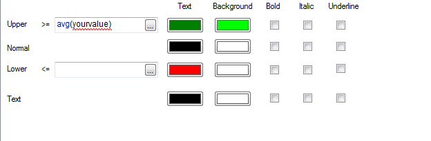
2) under visual clues try
upper Limit: >= avg(value) and define Color, same to other colors
- Mark as New
- Bookmark
- Subscribe
- Mute
- Subscribe to RSS Feed
- Permalink
- Report Inappropriate Content
Hi Rudolf
1) Found design grid and then selected colum header I want to change; however, no option to just chnage the selected. Apply change 'all dimensions' only so as a result all the column headers change colour.
2) Sorry but I dont understnd this. when you say value what figure is this? and defining colour do you mean the RGB, e.g (255,0,0)
Chris
- Mark as New
- Bookmark
- Subscribe
- Mute
- Subscribe to RSS Feed
- Permalink
- Report Inappropriate Content
1) then goto your Dimension, click on sign +, select Background Color and define your Color (with rgb code, but prefeered by variable which contains rgb code)
2) like in Picture, you can define a Color direct or enter a calcualation (rgb code, variable etc,)
- Mark as New
- Bookmark
- Subscribe
- Mute
- Subscribe to RSS Feed
- Permalink
- Report Inappropriate Content
Hi Rudolf,
1) Now working - thank you
2) Your value? is this the number lke 4.7? The number is different for each service area though so the expression would need to be more dynamic than that?..I guess almost an If statement.
Sorry if this comes across really silly.
Chris
- Mark as New
- Bookmark
- Subscribe
- Mute
- Subscribe to RSS Feed
- Permalink
- Report Inappropriate Content
Hi ,
1 .Use custom format cell to color header.
2. To color the data in the expression.
Under text color--> if(Target14/16 > 1,green(),Red())
- Mark as New
- Bookmark
- Subscribe
- Mute
- Subscribe to RSS Feed
- Permalink
- Report Inappropriate Content
what do you want in Point 2
example: you have Dimension SalesPerson and Expression sum(sales);
you want to Highlight when a salesperson sells above average of salesperson
then avg(sales) would do it
-> I have a straight table exactly like that with other Dimension, Expression). I only see those datarows which meets the condition with the defined Color
If this doesnot meet your requirement then you should specify more in Detail wah you want to achieve. Or best, post a small example! I hope this doesnot sound silly,but in my case it works!
- Mark as New
- Bookmark
- Subscribe
- Mute
- Subscribe to RSS Feed
- Permalink
- Report Inappropriate Content
Text colour isn't an option in an expression - only in dimensions tab...?
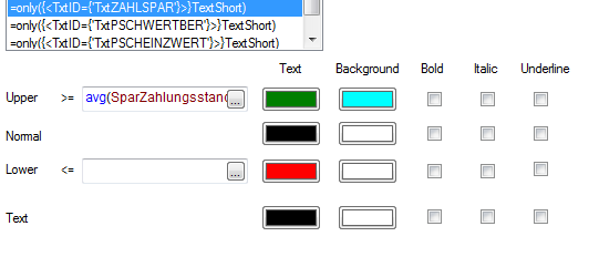
I've added the expression in visual clues...asumme this one would be used for 'lower' and then flip it for 'Upper'
if([Target 15/16] > 1,green(),Red())
- Mark as New
- Bookmark
- Subscribe
- Mute
- Subscribe to RSS Feed
- Permalink
- Report Inappropriate Content
Hi,
We want the 'average (mean score)' box for each service area to go either green or red depending on the score. So:
- if the average mean score is higher then the 'target' figure we want it to colour green automatically
- if the average mean score is lower then the 'target' figure we want it to colour red automatically
- Mark as New
- Bookmark
- Subscribe
- Mute
- Subscribe to RSS Feed
- Permalink
- Report Inappropriate Content
| ID | Budget | Sales |
|---|---|---|
| 1 | 99 | 100 |
| 2 | 250 | 200 |
| 3 | 350 | 300 |
| 4 | 250 | 400 |
| 5 | 500 | 100 |
| 6 | 1000 | 600 |
Look in the above table .data is in red and green colors .Is that you are looking for ?
If that is your requirement Use text color
- « Previous Replies
-
- 1
- 2
- Next Replies »