Unlock a world of possibilities! Login now and discover the exclusive benefits awaiting you.
- Qlik Community
- :
- All Forums
- :
- QlikView App Dev
- :
- expression sort consistent
- Subscribe to RSS Feed
- Mark Topic as New
- Mark Topic as Read
- Float this Topic for Current User
- Bookmark
- Subscribe
- Mute
- Printer Friendly Page
- Mark as New
- Bookmark
- Subscribe
- Mute
- Subscribe to RSS Feed
- Permalink
- Report Inappropriate Content
expression sort consistent
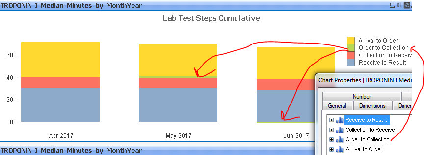
How can I make the colors in a stacked bar chart always appear in the same order (across dimension values)? See in image how green "Order to Collection" section sometimes appears in one month second from top, in another month last (4th from top).
- « Previous Replies
-
- 1
- 2
- Next Replies »
Accepted Solutions
- Mark as New
- Bookmark
- Subscribe
- Mute
- Subscribe to RSS Feed
- Permalink
- Report Inappropriate Content
- Mark as New
- Bookmark
- Subscribe
- Mute
- Subscribe to RSS Feed
- Permalink
- Report Inappropriate Content
Can you share a sample.? May be your June 2017 sum value is less than 10 so it is plotting the color near that axis.
- Mark as New
- Bookmark
- Subscribe
- Mute
- Subscribe to RSS Feed
- Permalink
- Report Inappropriate Content
I made some tests and I can't get the same result, the expressions are always sorted in the same order.
Can you post a sample to check?
- Mark as New
- Bookmark
- Subscribe
- Mute
- Subscribe to RSS Feed
- Permalink
- Report Inappropriate Content
it is close to 10 in May too though. I will post a sample as soon as I can. Have to clear out all the irrelevant stuff first...
- Mark as New
- Bookmark
- Subscribe
- Mute
- Subscribe to RSS Feed
- Permalink
- Report Inappropriate Content
see attached.
- Mark as New
- Bookmark
- Subscribe
- Mute
- Subscribe to RSS Feed
- Permalink
- Report Inappropriate Content
Your OrderTocollection for Month June-2017 shows -1 ? This could be the reason.
- Mark as New
- Bookmark
- Subscribe
- Mute
- Subscribe to RSS Feed
- Permalink
- Report Inappropriate Content
May be you can try like?
= Fabs(Median(Ord_Coll_Mins))
- Mark as New
- Bookmark
- Subscribe
- Mute
- Subscribe to RSS Feed
- Permalink
- Report Inappropriate Content
You're right. It's the "-1". But its supposed to be "-1", not "1". (We have some psychics around here.)
Thank you.
So I need to figure out how to ignore negative numbers..... or turn any negative number into a zero...?
- Mark as New
- Bookmark
- Subscribe
- Mute
- Subscribe to RSS Feed
- Permalink
- Report Inappropriate Content
Or maybe I'll just explain to end users what they are looking at... It does a pretty job of illustrating what's going on.
The only better option would be to Collection to Receive time overlap with Arrival to Order time by one minute.
- Mark as New
- Bookmark
- Subscribe
- Mute
- Subscribe to RSS Feed
- Permalink
- Report Inappropriate Content
oh Ok you can turn negative values to 0 using if like
= If (median(Ord_Coll_mins) < 0, 0, median(ord_coll_mins))
- « Previous Replies
-
- 1
- 2
- Next Replies »