Unlock a world of possibilities! Login now and discover the exclusive benefits awaiting you.
- Qlik Community
- :
- All Forums
- :
- QlikView App Dev
- :
- piled bar graphs not possible?
- Subscribe to RSS Feed
- Mark Topic as New
- Mark Topic as Read
- Float this Topic for Current User
- Bookmark
- Subscribe
- Mute
- Printer Friendly Page
- Mark as New
- Bookmark
- Subscribe
- Mute
- Subscribe to RSS Feed
- Permalink
- Report Inappropriate Content
piled bar graphs not possible?
Hello,
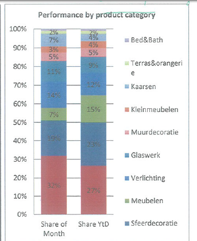
can someone help me how i should make a graph like the one below?
i would think that it was an option under the "bar graphs" where i could say that the different dimensions are piled.
what i want is the % part of sales per product family.
and i want 1 bar to show sales for the current selected month, and 1 bar that shows the % division for whole the year.
thanx!
chris
- « Previous Replies
-
- 1
- 2
- Next Replies »
Accepted Solutions
- Mark as New
- Bookmark
- Subscribe
- Mute
- Subscribe to RSS Feed
- Permalink
- Report Inappropriate Content
"is there a reason to have a preference for the one or the other solution?"
One is script based, one is front end only.
"but isn't it necessary that the KPI table has a link somewhere to the 'facts'?
because i see that you two unlinked tables, what's the theory behind this?"
No, it it's not necessary. If you don't have a link, your measures won't be grouped by your dimension, i.e. all records in your selection are inputted to your expression for both dimension values.
- Mark as New
- Bookmark
- Subscribe
- Mute
- Subscribe to RSS Feed
- Permalink
- Report Inappropriate Content
Chris, maybe like attached?
- Mark as New
- Bookmark
- Subscribe
- Mute
- Subscribe to RSS Feed
- Permalink
- Report Inappropriate Content
Thank you!
i'm trying this right now.
but isn't it necessary that the KPI table has a link somewhere to the 'facts'?
because i see that you two unlinked tables, what's the theory behind this?
thanx!
chris
- Mark as New
- Bookmark
- Subscribe
- Mute
- Subscribe to RSS Feed
- Permalink
- Report Inappropriate Content
HI
You can use like this also,
Dimension
=ValueList('Share of Month','Share of Year')
ProductCategory
Expression
if(ValueList('Share of Month','Share of Year') = 'Share of Month',
sum(Value) / sum(total Value), sum({<Month = {"<=$(=max(Month))"}>} Value) /sum({<Month = {"<=$(=max(Month))"}>} total Value)
)
Mr.swuehl used KPI value in inline table, for dimension purpose..
Please close the thread by marking correct answer & give likes if you like the post.
- Mark as New
- Bookmark
- Subscribe
- Mute
- Subscribe to RSS Feed
- Permalink
- Report Inappropriate Content
is there a reason to have a preference for the one or the other solution?
i will try the 2.
thanx!
chris
- Mark as New
- Bookmark
- Subscribe
- Mute
- Subscribe to RSS Feed
- Permalink
- Report Inappropriate Content
"is there a reason to have a preference for the one or the other solution?"
One is script based, one is front end only.
"but isn't it necessary that the KPI table has a link somewhere to the 'facts'?
because i see that you two unlinked tables, what's the theory behind this?"
No, it it's not necessary. If you don't have a link, your measures won't be grouped by your dimension, i.e. all records in your selection are inputted to your expression for both dimension values.
- Mark as New
- Bookmark
- Subscribe
- Mute
- Subscribe to RSS Feed
- Permalink
- Report Inappropriate Content
thanx, for the explanation, i got the both ways to work!
grtz,
chris
- Mark as New
- Bookmark
- Subscribe
- Mute
- Subscribe to RSS Feed
- Permalink
- Report Inappropriate Content
If you don't mind me asking - *why* do you need this particular graph? Wouldn't you be better off with a pair of non-stacked bar charts, or a grouped bar chart with Product Category as the dimension?
- Mark as New
- Bookmark
- Subscribe
- Mute
- Subscribe to RSS Feed
- Permalink
- Report Inappropriate Content
Hello,
if you look at my first post in this question, there is the graph i had in my excel reporting.
and i find it visually easier to compare the size of a product category if they are right next to each other.
in excel i could include the % values, and that i can't find in qlikview,
and that indeed makes it harder to compare.
but still i find it easier to compare than in the grouped bar chart where you need to allways jump over a few bars.
but tomorrow i might try the pair of non-stacked bar charts, to see what that does visually to compare.
grtz,
chris
- Mark as New
- Bookmark
- Subscribe
- Mute
- Subscribe to RSS Feed
- Permalink
- Report Inappropriate Content
Let me know how that works out, if you don't mind.
Personally, I'm not a proponent of stacked graphs - they're very hard to read because color chunks don't start at the same spot. In your example, the 14% and 12% dark blue chunks look like they're about the same size to me. Insofar as placing the actual numbers in the graph - sure, you can - but then you're better off with a graph-and-table combination.
Assuming you have the space, here is how I'd probably go about doing this:
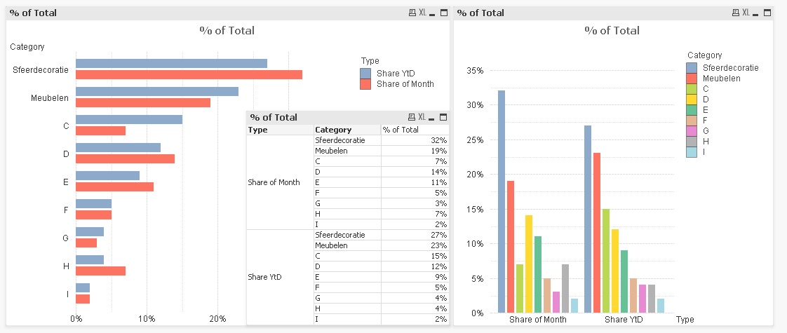
Note:
* We can easily compare categories across periods by using the left graph. This is particularly nice because we don't have to use the legend to figure out which category is which.
* We can easily compare the makeup of each period using the right graph - now the difference in the fourth category (yellow) is a lot easier to see even though we're still looking at periods rather than categories.
* We can easily get the numeric values using the table (the pivot table's dimension can be swapped by dragging, allowing easy comparison of either periods or categories).
Ultimately, it's a matter of personal preference, of course - mine is to use less information and more graphs rather than forcing a single graph to allow multiple (and significantly different) types of analysis.
- « Previous Replies
-
- 1
- 2
- Next Replies »