Unlock a world of possibilities! Login now and discover the exclusive benefits awaiting you.
- Qlik Community
- :
- All Forums
- :
- QlikView App Dev
- :
- show cluster/groups/dimension directly in a curve
- Subscribe to RSS Feed
- Mark Topic as New
- Mark Topic as Read
- Float this Topic for Current User
- Bookmark
- Subscribe
- Mute
- Printer Friendly Page
- Mark as New
- Bookmark
- Subscribe
- Mute
- Subscribe to RSS Feed
- Permalink
- Report Inappropriate Content
show cluster/groups/dimension directly in a curve
Hello everyone,
we have a case where a custumor wants to have a new linial diagram. At first sieght it didn't seem complicated and now I really don't know if this kind of curve in a diagram is possible.
The idea comes from following situation:
The customer owns a slaughter house fro pigs. The pigs are deliveres in batches from companys.
So at some point comes a batch of pigs from comp_nr =1 and lets say they count the animal_ID.
This customer wants to have a kurve in a diagram, that looks like this
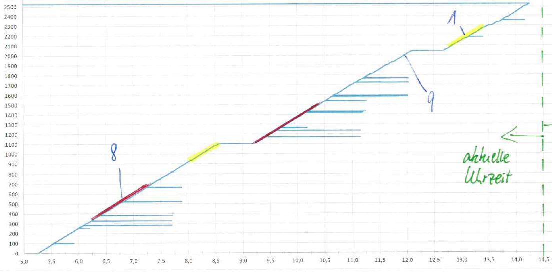
At the x achses is a time line and the y achses the counted numbers. In the diagram should be ploted a kurve where he can distinct through colors from what kind of comp_nr the pigs were counted at the specific time.
My solution goes in the right direction, but i can't distinct the different comp_nr in the needed curve.
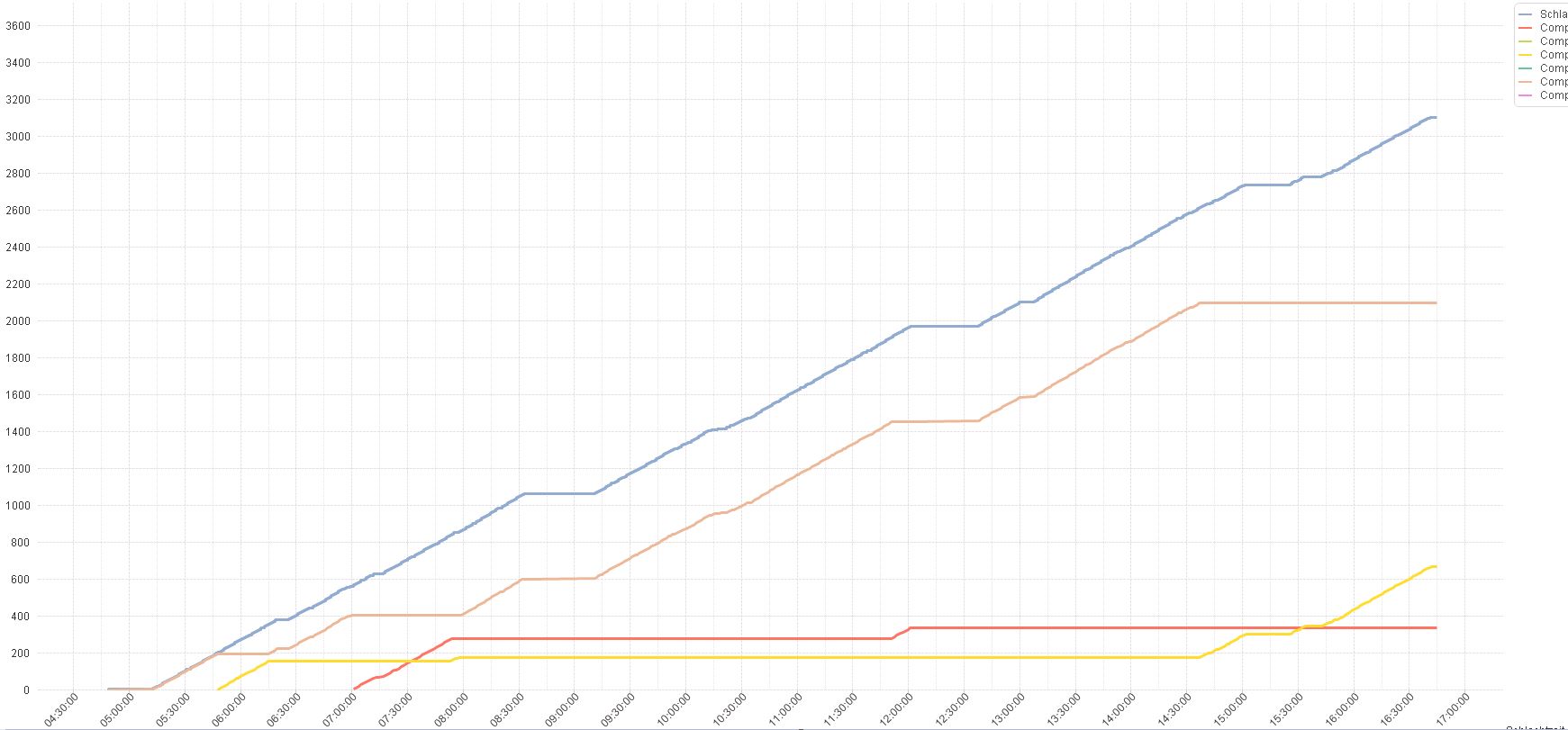
I have two dimensions ( time and comp_nr) and several formulas
The blue colored curve is an accumulated kurve of this formula Count ( animal_ID) an shows the numers of pigs from all comp_nr's
And the other curves just count over each comp_nr.
Basically the customer would get through my solution the same information, but it's a little bit complicated to read.
Did anybody had a similiar case or has a solution.