Unlock a world of possibilities! Login now and discover the exclusive benefits awaiting you.
- Qlik Community
- :
- All Forums
- :
- QlikView Integrations
- :
- Chart representation
- Subscribe to RSS Feed
- Mark Topic as New
- Mark Topic as Read
- Float this Topic for Current User
- Bookmark
- Subscribe
- Mute
- Printer Friendly Page
- Mark as New
- Bookmark
- Subscribe
- Mute
- Subscribe to RSS Feed
- Permalink
- Report Inappropriate Content
Chart representation
I have this graph in which the red bar represents the new products that have arrived, the blue bar represents the pending units (this are the units that have arrived and must be repaired) and the green bar represents the number of units that have been repaired.
I have used he following expressions:
New products: count({$<DateType={'Arrived'}>} ProductID )
Repaired: count({$<DateType={'Repaired'}>} ProductID )
Pending Units: rangesum(above(total count({$<DateType={'Arrived'}>} ProductID ),0,RowNo(total)))-rangesum(above(total count({$<DateType={'Repaired'}>} ProductID ),0,RowNo(total)))
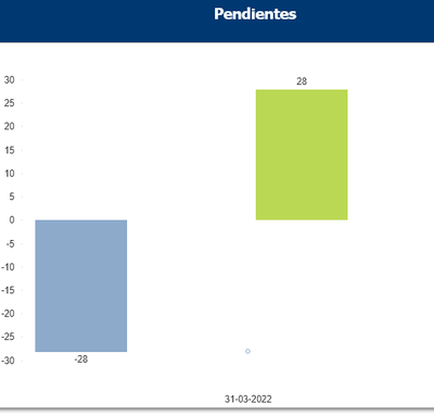
This is showing my data correctly but when I select a particular date, the formulas apparently apply from that date and not for the total of the data.
For example when the date 31/03/2022 is selected the representation changes from the one seen above to the following:
How can I avoid this?
Accepted Solutions
- Mark as New
- Bookmark
- Subscribe
- Mute
- Subscribe to RSS Feed
- Permalink
- Report Inappropriate Content
Not sure if there is a better solution, I went into Properties-->General-->Read Only
- Mark as New
- Bookmark
- Subscribe
- Mute
- Subscribe to RSS Feed
- Permalink
- Report Inappropriate Content
Not sure if there is a better solution, I went into Properties-->General-->Read Only

