Unlock a world of possibilities! Login now and discover the exclusive benefits awaiting you.
- Qlik Community
- :
- All Forums
- :
- QlikView App Dev
- :
- Example how to create a statistical box-plot objec...
- Subscribe to RSS Feed
- Mark Topic as New
- Mark Topic as Read
- Float this Topic for Current User
- Bookmark
- Subscribe
- Mute
- Printer Friendly Page
- Mark as New
- Bookmark
- Subscribe
- Mute
- Subscribe to RSS Feed
- Permalink
- Report Inappropriate Content
Example how to create a statistical box-plot object in the Dashboard for the graphical representation of a KPI
In the design of a useful dashboard one is often faced with the problem represent as much information while at the same time keep the number of objects slim in the surface.
Based on the box-plot object (see Figure 1) can be derived in the dashboard at a glance information about:
- Minimum value (gray line on the left)
- Maximum value (gray line on the right)
- Median (0.5 quantile, fat red bar in the middle)
- 0.25- and 0.75- quantile (as viewing limits relevant for the median calculation, adjusted by statistical outliers, thin orange dashed lines to the left and right)
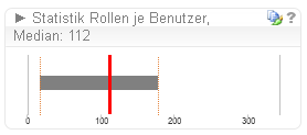
Figure 1
In addition to the multi-layered graphical summarization of information other information in the box plot can be embedded object. By clicking the button (the question mark icon, top right) in the object are useful statistical functions are displayed (see Figure 2):
- Arithmetic mean
- Statistical outlier range
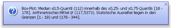
Figure 2
The expansion of the list of useful statistical information are no limits in QlikView and can be extended. The arithmetic mean does not consider the bias by statistical outliers. Due to the advantage of the informational value of the median value object is made in the forefront of consideration in the box plot. In the runnable sample-QVD in the appendix of the test data set for the Value field is loaded with the data row: (1,2,10,12,12,16,17,23,30,100).
There is no coding necessary in the script to match the box plot object to the own project developments. The field name Value would then be appropriately renamed This selects the field you. The settings are made in the property-tabs:
- General (in the text box : window title)
- Formulas (1. in the text box: definition; 2. somewhat hidden in the formula bar base, see Figure 2)
- Presentation (in the list: position lines, total for all of the five contained entries)
- Axes (in the text boxes: scale minimum and maximum, top right)
- Title bar (text box: comment, bottom right)
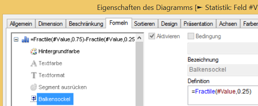
Figure 3
Conveniently, there are no macros or other adjustments or installations are necessary. The object is a simple chart (Chart type: bar chart, in the orientation horizontal).
This example can also be adapted for aggregate functions.
About Feedback rejoices the Alpha Omega Projects Team.
I hope the box plot object will help you further in managing the balancing act in the design of clear - informative dashboards.
Your Lutz Gülker