Unlock a world of possibilities! Login now and discover the exclusive benefits awaiting you.

- Qlik Community
- :
- All Forums
- :
- QlikView
- :
- Bar Chart with gap and text
- Subscribe to RSS Feed
- Mark Topic as New
- Mark Topic as Read
- Float this Topic for Current User
- Bookmark
- Subscribe
- Mute
- Printer Friendly Page

- Mark as New
- Bookmark
- Subscribe
- Mute
- Subscribe to RSS Feed
- Permalink
- Report Inappropriate Content
Bar Chart with gap and text
Hi all,
I have a table like
| Type | % | Points |
| A Batting | 95 | 0.9 |
| A Bowling | 86 | 0.6 |
| B Batting | 97 | 0.7 |
| B Bowling | 84 | 0.5 |
| C Batting | 101 | 1.1 |
| C Bowling | 94 | 0.9 |
And i want to create a bar chart like this
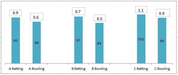
which should have
1. Space between the various groups A,B and C.
2. Points to indicate on the top of bars and % values in the data points.
Can you please help me with this.
Thanks in advance.
Regards,
Kuldeep
- Tags:
- new_to_qlikview
- « Previous Replies
-
- 1
- 2
- Next Replies »
- Mark as New
- Bookmark
- Subscribe
- Mute
- Subscribe to RSS Feed
- Permalink
- Report Inappropriate Content
And thanks Navven 
- Mark as New
- Bookmark
- Subscribe
- Mute
- Subscribe to RSS Feed
- Permalink
- Report Inappropriate Content
Hey Manish,
I am doing everything correct. Getting the same results.
Just not getting the numbers of % on the bar.
Don't know where i am going wrong. Could you please help?
Regards,
Kuldeep

 MK_QSL
- Mark as New
- Bookmark
- Subscribe
- Mute
- Subscribe to RSS Feed
- Permalink
- Report Inappropriate Content
If you check my file... there are two bar charts one on top of other... that's a trick i have used. Try to move the two charts side by side.. .you will realize/understand what i have done...
Let me know if still you are having problem..
- Mark as New
- Bookmark
- Subscribe
- Mute
- Subscribe to RSS Feed
- Permalink
- Report Inappropriate Content
Hey Manish,
I tried but still was not able to get the solution.
Considering this data, how to make a similar horizontal bar chart
| Team | Type | % | Count |
| India | Batting | 99 | -0.9 |
| India | Bowling | 95 | -0.6 |
| SA | Batting | 87 | -9.6 |
| SA | Bowling | 94 | -0.5 |
| AUS | Batting | 96 | -1.0 |
| AUS | Bowling | 93 | -0.3 |
| MI | Batting | 101 | 0.2 |
| MI | Bowling | 96 | -0.1 |
| NZ | Batting | 93 | -0.9 |
| NZ | Bowling | 78 | -0.2 |
| RR | Batting | 99 | -0.5 |
| RR | Bowling | 99 | 0.0 |
| US | Batting | 96 | -12.6 |
| US | Bowling | 95 | -1.7 |
Also i need to put color conditions on the % bar numbers,
If % <95, then green
else if %>95 and %< 100 then amber
and more than 100 then red.
Regards,
Kuldeep
MK_QSL
- Mark as New
- Bookmark
- Subscribe
- Mute
- Subscribe to RSS Feed
- Permalink
- Report Inappropriate Content
Check enclosed file..
- Mark as New
- Bookmark
- Subscribe
- Mute
- Subscribe to RSS Feed
- Permalink
- Report Inappropriate Content
Finally i got it. This is really awesome and cool trick.
Thanks again
- « Previous Replies
-
- 1
- 2
- Next Replies »