Unlock a world of possibilities! Login now and discover the exclusive benefits awaiting you.

- Qlik Community
- :
- All Forums
- :
- QlikView
- :
- Bar chart going below '0'
- Subscribe to RSS Feed
- Mark Topic as New
- Mark Topic as Read
- Float this Topic for Current User
- Bookmark
- Subscribe
- Mute
- Printer Friendly Page

- Mark as New
- Bookmark
- Subscribe
- Mute
- Subscribe to RSS Feed
- Permalink
- Report Inappropriate Content
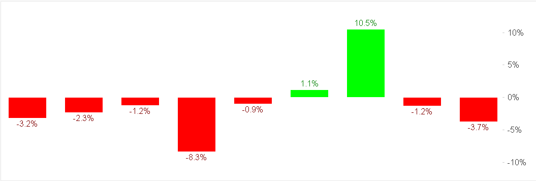
Bar chart going below '0'
Hello there,
is there a way to show this graph with all the red columns (minus 0) to be graphically below '0' and only the 2 green columns as they are right now.
thanks for your help
JP

Accepted Solutions

 Mark_Little
- Mark as New
- Bookmark
- Subscribe
- Mute
- Subscribe to RSS Feed
- Permalink
- Report Inappropriate Content
Hi,
It should be possible. Are you using the FABS() function to make the values all Positive?
If so you could add a expression to the background colour.
In the chart properties > expressions. Press the little plus symbol click on the Background colour
Add the below in the definition
IF(SUM(Value) > 0, Red(), Green())
You could change the colour to RGB values.
Mark
Mark_Little
- Mark as New
- Bookmark
- Subscribe
- Mute
- Subscribe to RSS Feed
- Permalink
- Report Inappropriate Content
Hi,
It should be possible. Are you using the FABS() function to make the values all Positive?
If so you could add a expression to the background colour.
In the chart properties > expressions. Press the little plus symbol click on the Background colour
Add the below in the definition
IF(SUM(Value) > 0, Red(), Green())
You could change the colour to RGB values.
Mark
- Mark as New
- Bookmark
- Subscribe
- Mute
- Subscribe to RSS Feed
- Permalink
- Report Inappropriate Content
Thanks Mark, it was the Fabs
now it is ok