Unlock a world of possibilities! Login now and discover the exclusive benefits awaiting you.

- Qlik Community
- :
- All Forums
- :
- QlikView
- :
- Calculated dimensions in scattered chart
- Subscribe to RSS Feed
- Mark Topic as New
- Mark Topic as Read
- Float this Topic for Current User
- Bookmark
- Subscribe
- Mute
- Printer Friendly Page

- Mark as New
- Bookmark
- Subscribe
- Mute
- Subscribe to RSS Feed
- Permalink
- Report Inappropriate Content
Calculated dimensions in scattered chart
Hi Community.
After some months following the forum I write my first post hoping someone can help.
I have a large document containing sales data. I defined an expression to calculate a "segment" to each client based on the average monthly sales range for the selected period (months).
I´m trying to draw a graph (not sure scattered/grid) to represent segments on the X axis. Y axis should represent total sales for clients of each segment and bubble diameter represents number of clients in the segment.
The X axis (segments) is defined using a calculated dimension, and maybe this is my problem. I can´t define an expression for Y axis using segment values.
I thought about defining segments in script, but that would make my graph static.
I attach a sample QVW to better explain the scenario.
Hope someone has been in a similar situation and can help where I´m absolutely stuck.
Thank you in advance.
Regards,
Luis
Accepted Solutions

 vgutkovsky
- Mark as New
- Bookmark
- Subscribe
- Mute
- Subscribe to RSS Feed
- Permalink
- Report Inappropriate Content
Luis,
It seems to me that a few things about your approach need to be revised. First of all, I think you are using the wrong chart type. You are using a grid chart, but should be using a scatter chart (bottom-left icon on the General tab). Second, you should give some thought as to what a "bubble" represents. From your description, it sounds like a bubble should be a Segment. If that's the case, then it does not make sense to have the X-Axis also represent Segment...
Vlad

 Gysbert_Wassena
- Mark as New
- Bookmark
- Subscribe
- Mute
- Subscribe to RSS Feed
- Permalink
- Report Inappropriate Content
Try =Aggr(Sum(Sales),Client) as your second calculated dimension
talk is cheap, supply exceeds demand
vgutkovsky
- Mark as New
- Bookmark
- Subscribe
- Mute
- Subscribe to RSS Feed
- Permalink
- Report Inappropriate Content
Luis,
It seems to me that a few things about your approach need to be revised. First of all, I think you are using the wrong chart type. You are using a grid chart, but should be using a scatter chart (bottom-left icon on the General tab). Second, you should give some thought as to what a "bubble" represents. From your description, it sounds like a bubble should be a Segment. If that's the case, then it does not make sense to have the X-Axis also represent Segment...
Vlad
- Mark as New
- Bookmark
- Subscribe
- Mute
- Subscribe to RSS Feed
- Permalink
- Report Inappropriate Content
Hi Gysbert.
At first, that expression seemed to work, but the resulting dimension doesn´t aggregate client results. There are two clients in segment E, client 4 (sales 20000) and client 5 (sales 20000), and the graph shows 20000 in total for segment E instead of 40000.
I tried aggregating the results in the expression, but then I get a dimension error, and that´s the point where I was before.
=Sum(Aggr(Sum(Sales),Client))
- Mark as New
- Bookmark
- Subscribe
- Mute
- Subscribe to RSS Feed
- Permalink
- Report Inappropriate Content
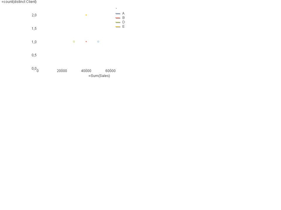
Hi Vlad
I think I understand what you say. In your approach, data should be represented as in the image I attach.
It makes sense but I think the other representation does it as well and, in theory, it should be possible, and it would if segmentation was in a column in the script instead of calculated in graph dimension.
- Mark as New
- Bookmark
- Subscribe
- Mute
- Subscribe to RSS Feed
- Permalink
- Report Inappropriate Content
Hello,
At last I followed Vlad´s advice and suggested alternative graphs at it seems that my initial approach wasn´t possible or wasn´t correct.
Thank you!