Unlock a world of possibilities! Login now and discover the exclusive benefits awaiting you.

- Qlik Community
- :
- All Forums
- :
- QlikView
- :
- Color Scatter Plot depending on threshold
- Subscribe to RSS Feed
- Mark Topic as New
- Mark Topic as Read
- Float this Topic for Current User
- Bookmark
- Subscribe
- Mute
- Printer Friendly Page

- Mark as New
- Bookmark
- Subscribe
- Mute
- Subscribe to RSS Feed
- Permalink
- Report Inappropriate Content
Color Scatter Plot depending on threshold
Hi,
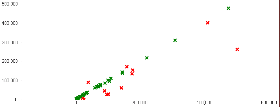
I have a scatter plot in my qlikview file (shown below) on the left are the prices I expected to pay and on the x axis are the prices actually paid. I would like to color the objects that fall into the trend area green and the outliers (i would say anything $10,000 off) in red. For example, the red x on the bottom right hand corner signifies that we thought we would have to pay about 260K and we paid about 500k
Could anyone assist with the formula in the expressions/dimensions I should have to color code this?
I CANNOT attach a sample document. Thanks for your help in advance!
Best,
Laila
Accepted Solutions

 swuehl
- Mark as New
- Bookmark
- Subscribe
- Mute
- Subscribe to RSS Feed
- Permalink
- Report Inappropriate Content
Maybe create a background color attribute expression for your x-axis expression like
=If( XExpression - YExpression > 10000, lightred(), lightgreen() )
replace XExpression resp. YExpression with your scatter chart axis expressions.
swuehl
- Mark as New
- Bookmark
- Subscribe
- Mute
- Subscribe to RSS Feed
- Permalink
- Report Inappropriate Content
Maybe create a background color attribute expression for your x-axis expression like
=If( XExpression - YExpression > 10000, lightred(), lightgreen() )
replace XExpression resp. YExpression with your scatter chart axis expressions.
- Mark as New
- Bookmark
- Subscribe
- Mute
- Subscribe to RSS Feed
- Permalink
- Report Inappropriate Content
Actually that was exactly what I was doing and also included absolute value. My problem was 10K was too small and made it look like it was not working. Thanks for your help!