Unlock a world of possibilities! Login now and discover the exclusive benefits awaiting you.

- Qlik Community
- :
- All Forums
- :
- QlikView
- :
- Re: Comparing one Employee's Productivity to Every...
- Subscribe to RSS Feed
- Mark Topic as New
- Mark Topic as Read
- Float this Topic for Current User
- Bookmark
- Subscribe
- Mute
- Printer Friendly Page

 proctors
- Mark as New
- Bookmark
- Subscribe
- Mute
- Subscribe to RSS Feed
- Permalink
- Report Inappropriate Content
Comparing one Employee's Productivity to Everyone Else's
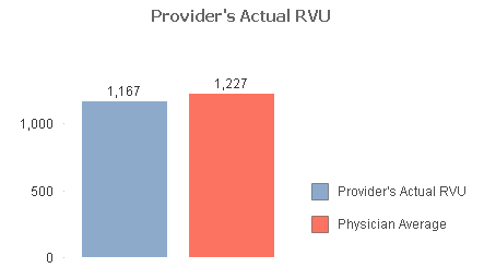
So we are trying to calculate an employees productivity, which is measured in RVU units to that of their own employee type. Now, it should also be noted that there are different types of employees, so we would also want them to be compared only to other employees of their type.
Here is the expression I've tried, but I cannot get it to show any data.
Used Dimensions for Bar Chart = [Employee Name]
Employee's Own Productivity =Sum([RVU WORK]) (This one works)
Other Employee's Productivity of the same Type (excluding the currently selected employee)
=avg(aggr(sum({<[Employee Name]-=[Employee Name]>}[RVU WORK]),[Employee Name], [Employee Type]))
- « Previous Replies
-
- 1
- 2
- Next Replies »
proctors
- Mark as New
- Bookmark
- Subscribe
- Mute
- Subscribe to RSS Feed
- Permalink
- Report Inappropriate Content
Yes, If I select A, I still want A's data in Column 1, but Column two should exclude their data.
proctors
- Mark as New
- Bookmark
- Subscribe
- Mute
- Subscribe to RSS Feed
- Permalink
- Report Inappropriate Content
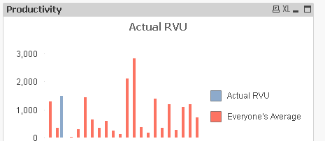
This one produced data, but instead gave me a bar line for each employee's data instead of the average of them all.
The blue line is the employee I selected, the reds are each employee's averages. How can I collapse all of theirs into one column?

 swuehl
- Mark as New
- Bookmark
- Subscribe
- Mute
- Subscribe to RSS Feed
- Permalink
- Report Inappropriate Content
You are using employee as dimension, right?
Try using no dimension, but the two expressions only.

 vvira1316
- Mark as New
- Bookmark
- Subscribe
- Mute
- Subscribe to RSS Feed
- Permalink
- Report Inappropriate Content
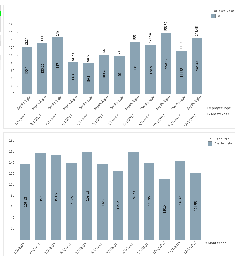
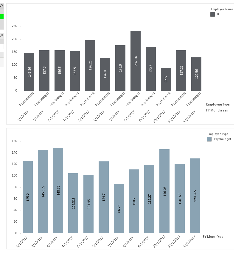
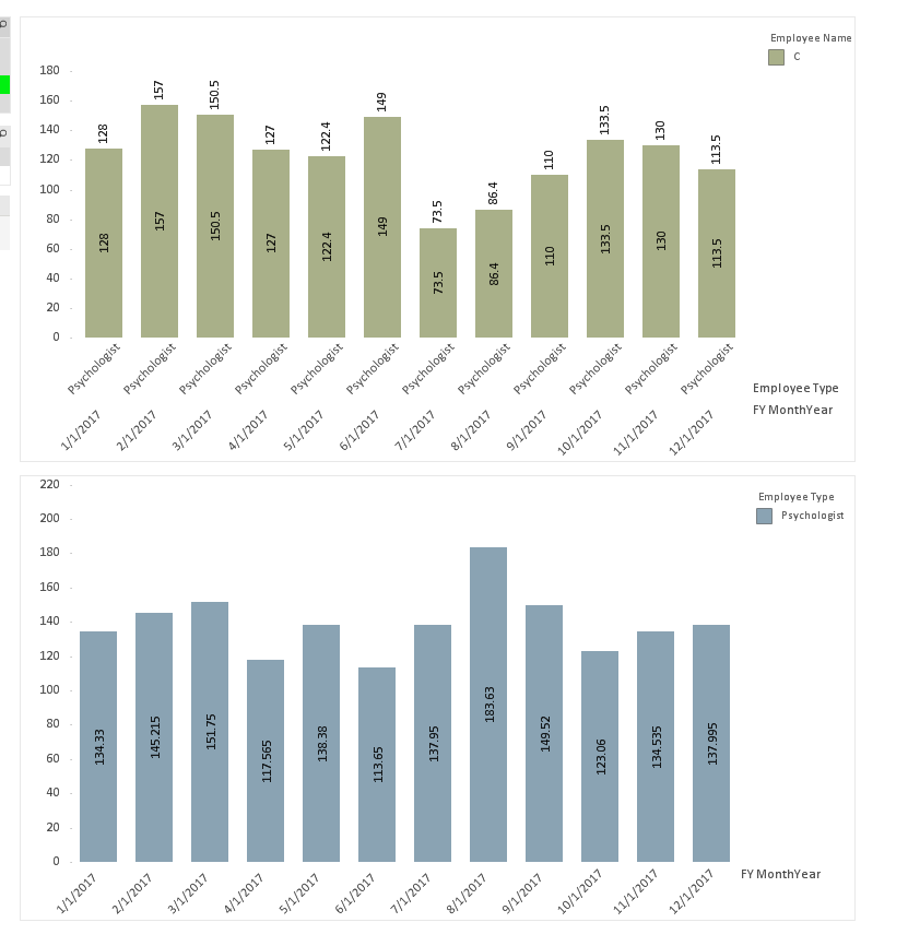
=Avg({<[FY MonthYear],[Employee Type]>}Aggr(Avg({<[Employee Name]=e()>}[RVU Work]),[FY MonthYear],[Employee Type]))
gives me what you are looking for but it will give only when something is selected
vvira1316
- Mark as New
- Bookmark
- Subscribe
- Mute
- Subscribe to RSS Feed
- Permalink
- Report Inappropriate Content
Hi,
I don't think you will be able to have that functionality in the same chart. You will have to separate those expressions in different charts.
I've expanded data set to try out... I think it is working the way you are looking for....
Please see attached....
Best Regards,
Vijay
proctors
- Mark as New
- Bookmark
- Subscribe
- Mute
- Subscribe to RSS Feed
- Permalink
- Report Inappropriate Content
Somehow this worked! Thanks.

- « Previous Replies
-
- 1
- 2
- Next Replies »