Unlock a world of possibilities! Login now and discover the exclusive benefits awaiting you.
- Qlik Community
- :
- All Forums
- :
- QlikView
- :
- Feasibility Check
- Subscribe to RSS Feed
- Mark Topic as New
- Mark Topic as Read
- Float this Topic for Current User
- Bookmark
- Subscribe
- Mute
- Printer Friendly Page
- Mark as New
- Bookmark
- Subscribe
- Mute
- Subscribe to RSS Feed
- Permalink
- Report Inappropriate Content
Feasibility Check
hello all,
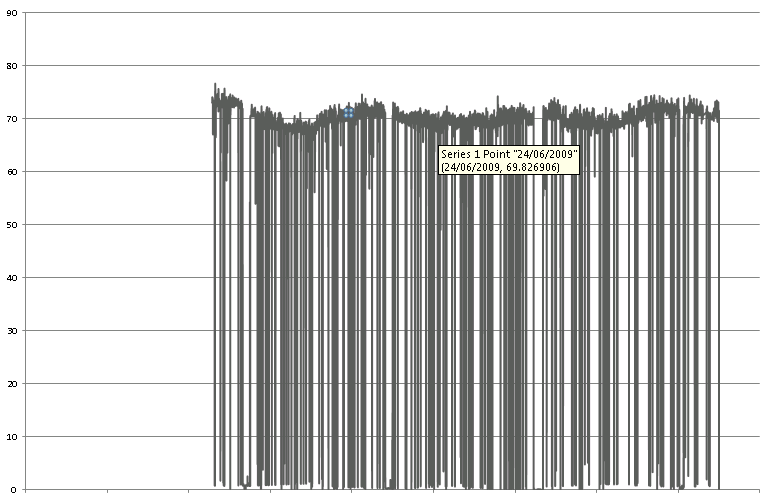
i am wondering, is it possible to create graph like this:
thank you all!
- Mark as New
- Bookmark
- Subscribe
- Mute
- Subscribe to RSS Feed
- Permalink
- Report Inappropriate Content
Not sure if I really understand your requirement. What is your graph showing / what is what you would like to show (i.e. your requirement)?
I could be pretty off, just guessing:
It looks to me that you are showing a bunch of pretty large values (around 70) and some very small (around zero). Your data points seems to be connected with lines, so that's what makes up the visual apperance of almost vertical lines - large fluctations in value.
Yes, you can get the same with QV, see attached (basically, it's a line chart with data like assumed above).
If this is not what you are looking for, it would be really helpful if you try to describe what the desired characteristics of your chart are.
Regards,
Stefan