Unlock a world of possibilities! Login now and discover the exclusive benefits awaiting you.
- Qlik Community
- :
- All Forums
- :
- QlikView
- :
- Graph in Qlikview
- Subscribe to RSS Feed
- Mark Topic as New
- Mark Topic as Read
- Float this Topic for Current User
- Bookmark
- Subscribe
- Mute
- Printer Friendly Page
- Mark as New
- Bookmark
- Subscribe
- Mute
- Subscribe to RSS Feed
- Permalink
- Report Inappropriate Content
Graph in Qlikview
Hello;
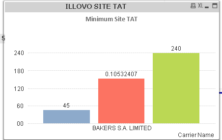
I would like to present this information in a chart e.g a bar graph showing minimum, maximum and average LoadingDuration for a carrier name.
What is the best graph to use? And what will be my dimensions and expressions?
Accepted Solutions
- Mark as New
- Bookmark
- Subscribe
- Mute
- Subscribe to RSS Feed
- Permalink
- Report Inappropriate Content
HI,
Well if you want to to just see the above, then a bar chart will be fine
Dimension Carrier Name
Expressions Min(LoadingDuration), Max(LoadingDuration), Avg(LoadingDuration)
If you want to see it over time add a dimension for Date if you have a calendar or floor one of the First pick dates.
Mark
- Mark as New
- Bookmark
- Subscribe
- Mute
- Subscribe to RSS Feed
- Permalink
- Report Inappropriate Content
Thanks Mark! Just that my average appears as 0.10532407. How do l fix that?