Unlock a world of possibilities! Login now and discover the exclusive benefits awaiting you.

- Qlik Community
- :
- All Forums
- :
- QlikView
- :
- Grouped Bar Chart for a single column data
- Subscribe to RSS Feed
- Mark Topic as New
- Mark Topic as Read
- Float this Topic for Current User
- Bookmark
- Subscribe
- Mute
- Printer Friendly Page

- Mark as New
- Bookmark
- Subscribe
- Mute
- Subscribe to RSS Feed
- Permalink
- Report Inappropriate Content
Grouped Bar Chart for a single column data
Hello.
I'm new to QlikView, but since I've read a lot of the manual and still can't do what I need, I had nowhere else to ask.
My question has 2 steps:
1) I have a column filled with A's, B's and C's, and I want a bar chart of their frequencies: a single bar that shows the proportion between those three factors. (A grouped bar chart for the column)
2) I actually have 10 columns like that, and I want a panel that shows one bars like the one described above for each column.
Is it possible? What dimensions and what expressions should I write for that?
English is not my mother tongue, I'm sorry for the mistakes I probably made.
Thank you in advance for your attention.

 jwjackso
- Mark as New
- Bookmark
- Subscribe
- Mute
- Subscribe to RSS Feed
- Permalink
- Report Inappropriate Content
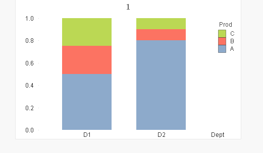
!Using this data:
Data:
LOAD * Inline [
Dept,Prod,Units
D1,A,10
D1,B,5,
D1,C,5,
D2,A,8,
D2,B,1,
D2,C,1
];
Dimensions are Dept,Prod
Expression is =Sum(Units)/Sum(Total <Dept>Units)
- Mark as New
- Bookmark
- Subscribe
- Mute
- Subscribe to RSS Feed
- Permalink
- Report Inappropriate Content
Actually, I can't group them like that because I need to be able to cross data between the columns.
My data looks like:
ID, item1, item2, item3
1, A, A, B
2, B, A, B
3, A, C, B
4, C, C, A
5, A, C, C
6, B, A, C
7, B, C, B
And I need to be able to filter between those columns, i.e.: "how does Item2 distributes among the ID's (rows) that have A in the column Item1?"