Unlock a world of possibilities! Login now and discover the exclusive benefits awaiting you.

Announcements
Want to see what's currently in public preview? We've pulled it all together in one place. Check it out here
- Qlik Community
- :
- All Forums
- :
- QlikView
- :
- How to create a A&E Funnel Plot
Options
- Subscribe to RSS Feed
- Mark Topic as New
- Mark Topic as Read
- Float this Topic for Current User
- Bookmark
- Subscribe
- Mute
- Printer Friendly Page
Turn on suggestions
Auto-suggest helps you quickly narrow down your search results by suggesting possible matches as you type.
Showing results for

Not applicable
2015-06-02
10:13 AM
- Mark as New
- Bookmark
- Subscribe
- Mute
- Subscribe to RSS Feed
- Permalink
- Report Inappropriate Content
How to create a A&E Funnel Plot
Hi,
I'm trying to achieve a similar chart to the one below:
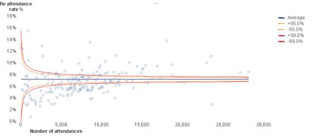
I want A&E attendances along the bottom and % performance on the y axis and dots to be the trusts.
I want to put the upper and lower limits as expressions and not in the script.
How can I do this?
I tried it as scatter graph and then tried it as a line chart as suggested, but still couldnt get anywhere.
Any help would be appreciated. I am totally lost now 
Thank you in advance.
553 Views
0 Replies