Unlock a world of possibilities! Login now and discover the exclusive benefits awaiting you.

- Qlik Community
- :
- All Forums
- :
- QlikView
- :
- How to display filter on a chart?
- Subscribe to RSS Feed
- Mark Topic as New
- Mark Topic as Read
- Float this Topic for Current User
- Bookmark
- Subscribe
- Mute
- Printer Friendly Page

- Mark as New
- Bookmark
- Subscribe
- Mute
- Subscribe to RSS Feed
- Permalink
- Report Inappropriate Content
How to display filter on a chart?
Hi All,
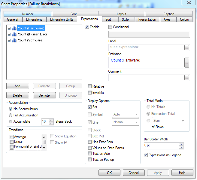
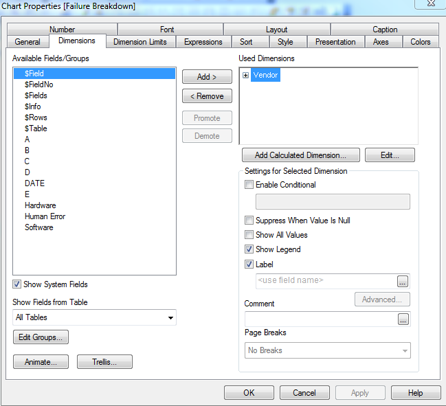
I want to be able to display just the TRUE values on a graph. Currently how I have it set up is in the Dimensions, I have one field selected (Vendor) which has 3 vendor filters. And then I have three expressions (type of failures) selected. For each expression, they each have TRUE/FALSE filters (TRUE being the failure occurred on the vendor, FALSE being it did not). Right now, the bar graph displays the total count of both TRUE and FALSE values.
I apologize since I am completely new to Qlikview & SQL. Any help is appreciated.

 MarcoWedel
- Mark as New
- Bookmark
- Subscribe
- Mute
- Subscribe to RSS Feed
- Permalink
- Report Inappropriate Content
please post some sample data and your expected result.
- Mark as New
- Bookmark
- Subscribe
- Mute
- Subscribe to RSS Feed
- Permalink
- Report Inappropriate Content
This is a sample of the data I imported from Excel:
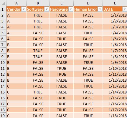
I chose the following for expressions:
And the Vendor for the Dimension:
So in the chart it displays the total count of failures for each vendor.
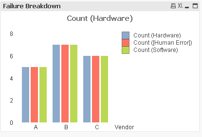
I would like to know how to display just the true values of each failure type on each vendor. So for example, having vendor A show 3 for Hardware, 1 for Human Error and 1 for Software and then the same for vendors B and C.

 BalaBhaskar_Qli
- Mark as New
- Bookmark
- Subscribe
- Mute
- Subscribe to RSS Feed
- Permalink
- Report Inappropriate Content
May be try these expressions:
Count({<Software = {"TRUE"}>}Vendor)
Count({<Hardware = {"TRUE"}>}Vendor)
Count({<[Human Error] = {"TRUE"}>}Vendor).
- Mark as New
- Bookmark
- Subscribe
- Mute
- Subscribe to RSS Feed
- Permalink
- Report Inappropriate Content
Where would I put those expressions? When I put them under conditional, the bars disappear.