Unlock a world of possibilities! Login now and discover the exclusive benefits awaiting you.

- Qlik Community
- :
- All Forums
- :
- QlikView
- :
- Line Chart - display continuous line when zero val...
- Subscribe to RSS Feed
- Mark Topic as New
- Mark Topic as Read
- Float this Topic for Current User
- Bookmark
- Subscribe
- Mute
- Printer Friendly Page

- Mark as New
- Bookmark
- Subscribe
- Mute
- Subscribe to RSS Feed
- Permalink
- Report Inappropriate Content
Line Chart - display continuous line when zero value
I have a chart with the following data.
x = 1,2,3,4,5,6,7,8,9,10
y = 2,3,2,3,0,0,4,5,3,4
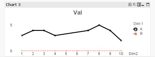
Does anyone know if it is possible to have a continuous line between points 4 and 7 in a similar fashion to Chart 1 Dim 1 = A in the attached doc, though I'd want a similar effect to Chart 3 i.e. dotted line when zero value to represent the anomoly?
Line Style : =IF(SUM({<[Dim 1]={'A'}>}Val)>0, '<S1>', '<S3>')
This is just a simplified example of what would be a standard time-series chart where certain months might be filtered out depending on user selections.

 settu_periasamy
- Mark as New
- Bookmark
- Subscribe
- Mute
- Subscribe to RSS Feed
- Permalink
- Report Inappropriate Content
Hi,
if you add the Dim1 as second dimension, it will give the straight line from 4 to 7, right?
or am i misunderstood?
- Mark as New
- Bookmark
- Subscribe
- Mute
- Subscribe to RSS Feed
- Permalink
- Report Inappropriate Content
Thanks for the reply.
It's more that I need to enforce the selection of only A in Dim 1 with Set Analytics in Chart 3 but look like you image above but dotted lines on Dim 1 = A between points 4 and 7.