Unlock a world of possibilities! Login now and discover the exclusive benefits awaiting you.

- Qlik Community
- :
- All Forums
- :
- QlikView
- :
- Percentage bar chart
- Subscribe to RSS Feed
- Mark Topic as New
- Mark Topic as Read
- Float this Topic for Current User
- Bookmark
- Subscribe
- Mute
- Printer Friendly Page

- Mark as New
- Bookmark
- Subscribe
- Mute
- Subscribe to RSS Feed
- Permalink
- Report Inappropriate Content
Percentage bar chart
Hi guys,
I have the following data:
ID Type Reactivated
1 A 0
2 A 0
3 A 0
4 A 0
5 A 0
6 B 1
7 B 0
8 B 0
9 B 0
10 B 0
What I want to do with this data is to create a bar chart. As dimensions, I have Type and Volume(which is not included here, it's irrelevant). I have created it, but I want to change it a bit.
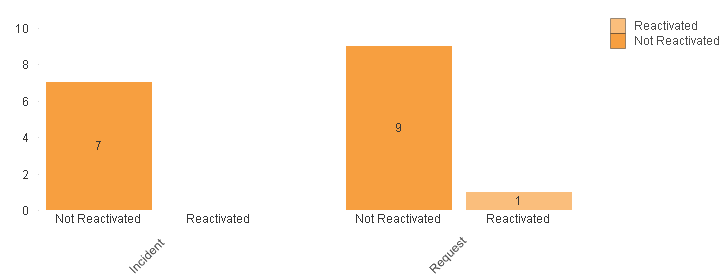
What I want to do is:
Incident - no Reactivation, therefore I would like the bar to show 100%
Request - one reactivation out of ten, therefore, I would like the bars to show 90% and 10%.
How could I do that?
Thank you so much for your help,
Adrian Culea
Accepted Solutions

 jagan
jagan
- Mark as New
- Bookmark
- Subscribe
- Mute
- Subscribe to RSS Feed
- Permalink
- Report Inappropriate Content
Hi,
Please find attached file for solution.
Removed Stack option.
Regards,
Jagan.
- Mark as New
- Bookmark
- Subscribe
- Mute
- Subscribe to RSS Feed
- Permalink
- Report Inappropriate Content
If I correctly understand your question then you want to represent values in percentage. For that you can go to the chart properties--Expressios Tab---Click the check box for Relative. It should work.

 rwunderlich
- Mark as New
- Bookmark
- Subscribe
- Mute
- Subscribe to RSS Feed
- Permalink
- Report Inappropriate Content
If Type and Reactivated are both Dimensions, the expression would be:
=count(ID) / count(TOTAL<Type>ID)
If Reactivated/Not Reactivated is created as two expressions, the expressions would be:
=count({<Reactivated={0}>}ID) / count(ID)
=count({<Reactivated={1}>}ID) / count(ID)
-Rob
- Mark as New
- Bookmark
- Subscribe
- Mute
- Subscribe to RSS Feed
- Permalink
- Report Inappropriate Content
Hi Rob,
This is not doing what I want. With your formulas, my report looks like this:
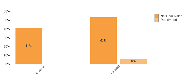
Basically, instead of 41% I would like to have 100% because there was no Reactivated Incident. In the request part, I would like the orange bar + pink bar to add up to 100% as well.
How could I do that?
Thanks,
Adrian
jagan
- Mark as New
- Bookmark
- Subscribe
- Mute
- Subscribe to RSS Feed
- Permalink
- Report Inappropriate Content
Hi,
Try like this
Data:
LOAD
ID,
Type,
If(Reactivated = 1, 'Reactivated', 'Not Reactivated') AS Status
INLINE [
ID , Type,Reactivated
1, A,0
2 ,A , 0
3, A , 0
4 ,A,0
5, A , 0
6 ,B,1
7, B , 0
8 ,B,0
9, B , 0
10, B , 0];
Now in chart:
Dimension: Type, Status
Expression : =Count(ID)/Count(TOTAL <Type> ID)
and in Style Tab : Select Stacked
Regards,
Jagan.
- Mark as New
- Bookmark
- Subscribe
- Mute
- Subscribe to RSS Feed
- Permalink
- Report Inappropriate Content
Nothing changes and anyway, I don't want a stacked graph. I would like to see:
Incidents: 100% Not Reactivated
Incidents: 0% Reactivated
Requests: 90% Not Reactivated
Requests: 10% Reactivated
Basically, 3 separate bars because the number of Reactivated Incidents is 0
Thanks,
Adrian
jagan
- Mark as New
- Bookmark
- Subscribe
- Mute
- Subscribe to RSS Feed
- Permalink
- Report Inappropriate Content
Hi,
Please find attached file for solution.
Removed Stack option.
Regards,
Jagan.
- Mark as New
- Bookmark
- Subscribe
- Mute
- Subscribe to RSS Feed
- Permalink
- Report Inappropriate Content
I do not understand. I have the same formula as you, still mine doesnt work .. Your graph looks exactly how I want mine to look like ...
- Mark as New
- Bookmark
- Subscribe
- Mute
- Subscribe to RSS Feed
- Permalink
- Report Inappropriate Content
Nevermind, It's working now. You gave me the correct answer! Thank you
- Mark as New
- Bookmark
- Subscribe
- Mute
- Subscribe to RSS Feed
- Permalink
- Report Inappropriate Content
Hi,
PFA, I hope this is what you want.
Regards,
Sudha E